Nothing fills a blank wall faster or cheaper than a set of framed pictures hung with care. You do not need expensive art or a designer. You need a tape measure, a plan, and the right spacing. A well-planned gallery wall can turn an empty living room wall into the warmest spot in your home. This guide walks you through the whole job, step by step. You will learn the exact height to hang your frames, how far apart to space them, how to plan the layout on paper, and how to mix sizes and styles without a mess. I have hung and styled walls for over fifteen years, and these are the same rules I teach every beginner.
In this guide:
- 1. Pick the Right Wall
- 2. The Eye-Level Rule: 57 to 60 Inches
- 3. The Spacing Formula: 2 to 3 Inches
- 4. Plan It on Paper First
- 5. The Grid Layout
- 6. The Salon (Organic) Layout
- 7. The Ledge Layout
- 8. Mixing Frame Sizes
- 9. Mixing Frame Styles and Colors
- 10. Choosing What Goes Inside the Frames
- 11. Tools You Really Need
- 12. Nails, Hooks, and Different Wall Types
- 13. Mistakes That Ruin the Look
- 14. Lighting Your Frames
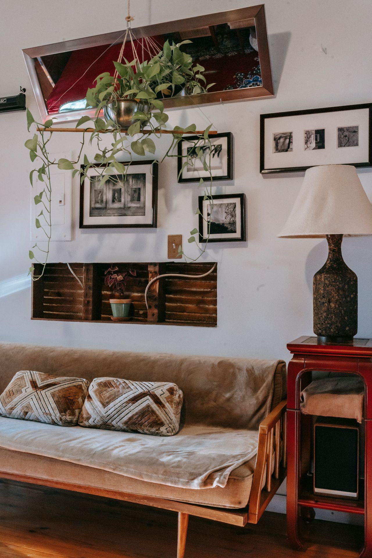
A living room with framed pictures arranged on the wall — Photo: Charlotte May, via Pexels
1. Pick the Right Wall
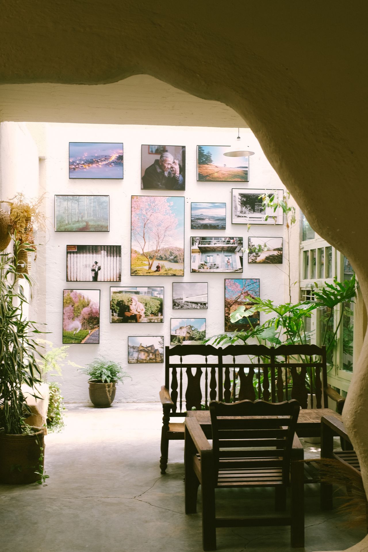
Framed art arranged on a white wall above a wooden table — Photo: Thanh Luu, via Pexels
Start with the wall you see most. In a living room, that is usually the wall behind the sofa or the big empty wall beside the TV — never the wall the TV sits on, because the screen will fight your frames for attention. The best walls have one thing in common: clear floor space in front of them, so you can step back six feet and see the whole display. Hallway walls, stairwells, and the wall above a console table are all strong choices. If you are still choosing the sofa that will sit under the frames, read our guide to choosing living room furniture first, so the furniture and the frames fit each other.
Size the display to the wall. A simple rule: your finished arrangement should fill about two-thirds of the wall width, or two-thirds of the furniture below it. On a 60-inch sofa, aim for frames that span roughly 40 inches in total. Measure the wall's width and height and write the numbers down before you buy a single frame. A tiny cluster lost on a huge wall looks like an afterthought, and an oversized display squeezed onto a small wall feels cramped. The two-thirds rule keeps both problems away.
2. The Eye-Level Rule: 57 to 60 Inches
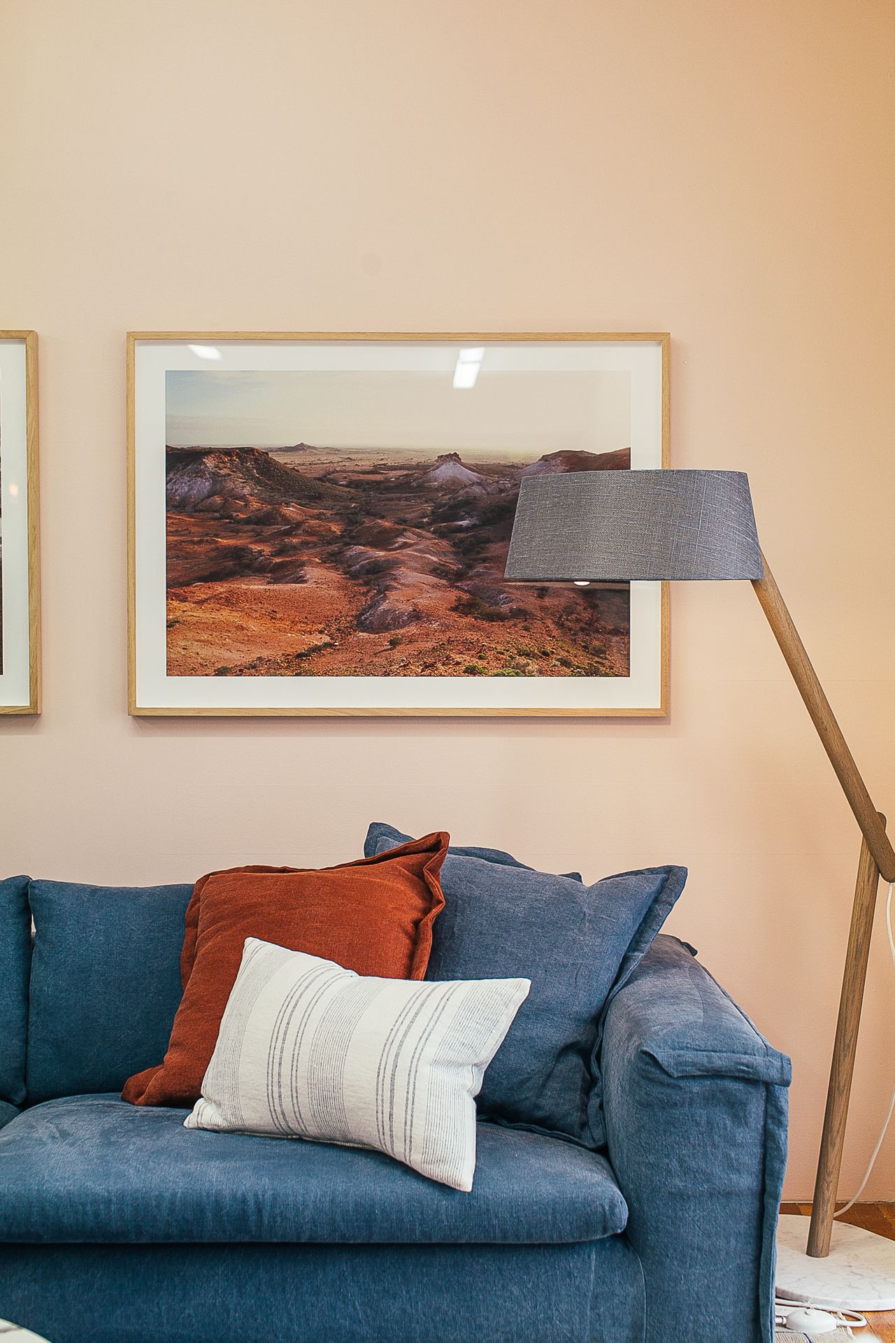
Pictures hung above a sofa and lamp in a cozy apartment — Photo: Rachel Claire, via Pexels
Museums hang art so its center sits at 57 inches from the floor, and that number works in homes too. For a multi-frame display, measure 57 to 60 inches (about 145 to 152 cm) to the center of the whole arrangement — not to the center of each frame. In a hallway where everyone stands, aim for 60 inches. In a dining room where people sit most of the time, 55 to 57 inches feels more natural, because eye level drops when you sit down.
When frames hang above furniture, there is a second rule. Leave 6 to 8 inches (15 to 20 cm) between the top of the sofa back and the bottom edge of the lowest frame. This gap connects the frames to the furniture so they read as one unit instead of two floating strangers. This matters a lot above light-colored seating — see our cream couch living room ideas for how the right height keeps a pale sofa from swallowing the art. If your sofa has a very low back, split the difference between the 57-inch rule and the 6-to-8-inch gap.
3. The Spacing Formula: 2 to 3 Inches
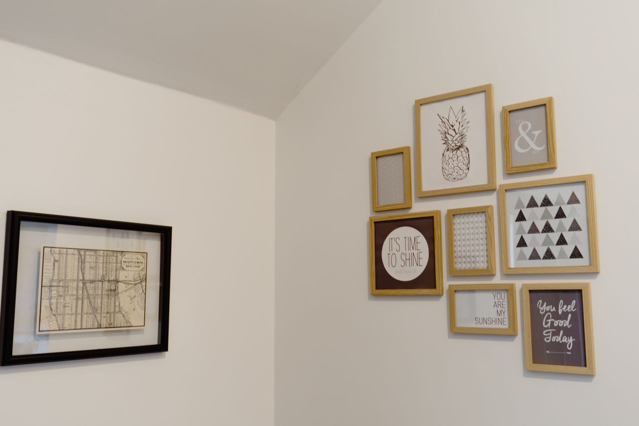
Wooden frames arranged with even spacing on a white wall — Photo: Polina, via Pexels
Keep 2 to 3 inches (5 to 8 cm) of empty wall between frames. This is the spacing designers use most, and it is the answer most people get wrong. Gaps under 2 inches make the frames crowd each other and look tense. Gaps over 4 inches break the group apart, and each frame starts to feel lonely. Consistency beats perfection here: pick one gap size and repeat it everywhere, and the whole display will look calm and planned even if the frames are all different.
Adjust the gap to the frame size for a pro finish. Small frames (8 by 10 inches or smaller) look best with 1.5 to 2 inches between them. Medium frames (11 by 14) take the standard 2 to 3 inches. Large frames (16 by 20 or bigger) need 3 to 4 inches of breathing room, because big art pushes more visual weight outward. Use a tape measure and a pencil to mark each gap — eyeballing is the number one reason spacing looks off in real homes.
4. Plan It on Paper First
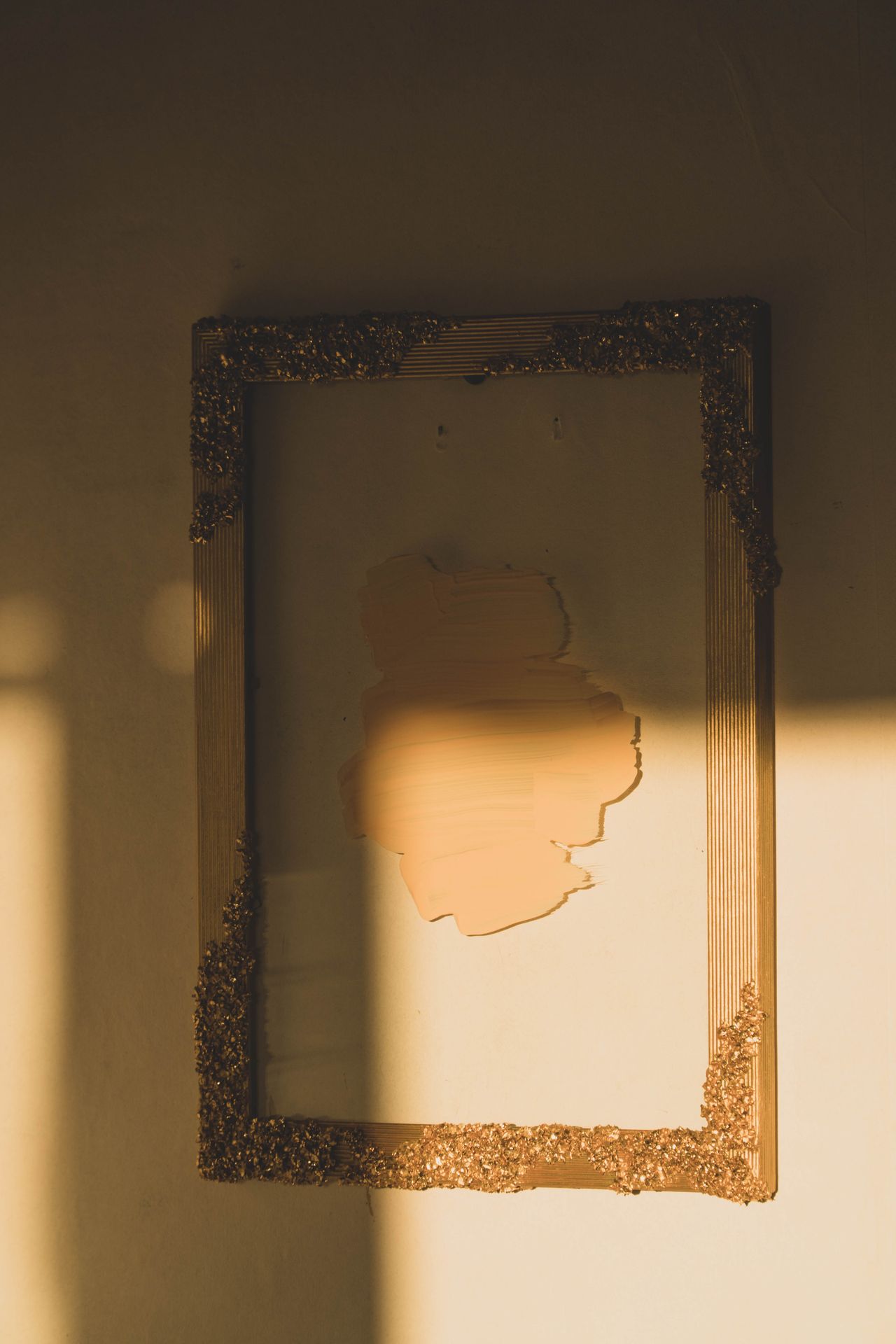
A single frame on a white wall, like a paper template placeholder — Photo: Katherine Mihailova, via Pexels
Never hammer a nail before you see the layout on the wall. Buy a roll of cheap kraft paper or brown wrapping paper and trace every frame onto it. Cut out the shapes, write the frame's name on each one, and tape them to the wall with painter's tape. Move them around freely — up, down, closer, wider — until the layout feels right. Step back six feet after every change, because a layout that looks fine from two feet away can look scattered from across the room.
The paper templates do a second job: they mark your nail spots. Flip each frame over and pull its hanging wire taut, then measure from the top edge of the frame down to the wire. Mark that same distance down from the top edge of the paper cutout, right in the center. Hammer the nail straight through the paper at that mark, then tear the paper away. The nail lands exactly where the wire needs it, on the first try, with no extra holes.
5. The Grid Layout
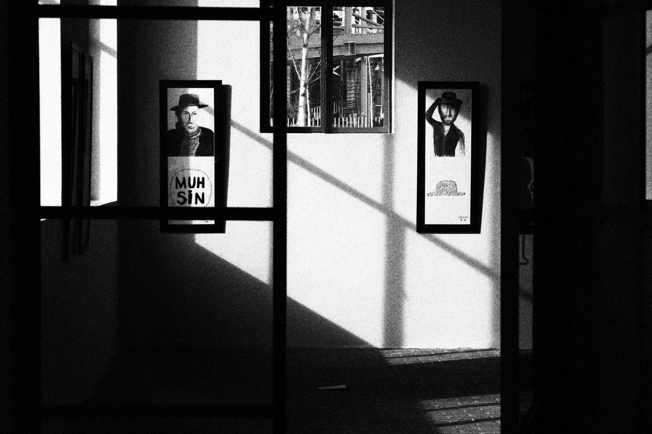
Frames hanging in a neat, even arrangement — Photo: dilara irem, via Pexels
The grid is the easiest layout to get right, and it suits modern rooms best. Use frames that are all the same size — nine 8-by-10 frames in a 3-by-3 square, or four 12-by-12 frames in a row. Hang them in straight rows and columns with identical 2-inch gaps. The trick is to treat the whole grid as one big frame: measure its total width and height, then center that rectangle on the wall or above the furniture, with its middle at 57 to 60 inches.
Do the math before you hang. Three 8-inch-wide frames with 2-inch gaps span 28 inches (8 plus 2 plus 8 plus 2 plus 8). Mark the center point of your wall, then measure half the total width — 14 inches — to each side. Black frames with white mats are the classic grid choice because the mats give every picture the same border of air. Keep all glass at the same sheen, too: mixing glossy and matte glass in a grid shows up as uneven reflections.
6. The Salon (Organic) Layout
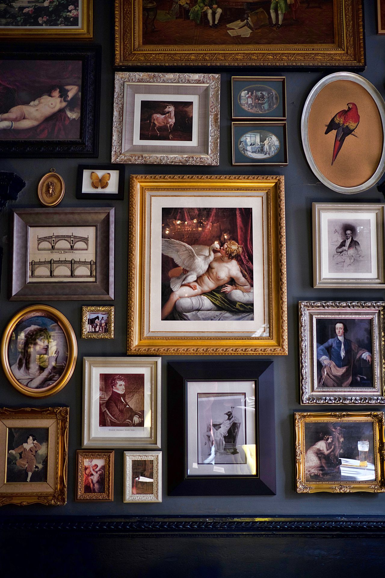
A mixed-size collection of framed art on one wall — Photo: Thomas balabaud, via Pexels
The salon layout is the classic museum style: different frame sizes clustered like a puzzle. Start with your anchor — the biggest or boldest piece — and hang it first, slightly off-center, with its middle near 57 inches. Then build outward in roughly decreasing size, keeping 2-to-3-inch gaps between every frame. Give the finished cluster an outer shape: a rough rectangle, a loose oval, or a staircase that climbs with the stairs. Without an outer shape, even beautiful frames read as clutter.
Balance visual weight as you go. Dark, colorful, or heavily textured pieces feel heavy; light, pale pieces feel light. Spread the heavy pieces around the cluster instead of bunching them on one side — one dark frame top-left wants another dark frame bottom-right. Three to seven frames is the sweet spot. Fewer than three looks accidental, and past nine you need real planning skill to keep it balanced. Photograph each version with your phone before you commit; the camera shows crooked gaps your eyes miss.
7. The Ledge Layout
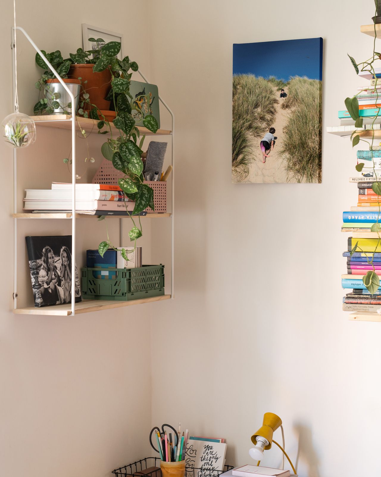
Picture frames styled on wall shelves — Photo: Squared one, via Pexels
Picture ledges are long, narrow shelves that let frames lean instead of hang. Mount two or three ledges in a vertical stack, spaced 10 to 12 inches apart, with the lowest ledge centered around 48 to 55 inches from the floor. Lean frames against the wall, overlapping them slightly front to back — big frames in back, small ones in front. You can swap art in seconds with no new holes, which makes ledges perfect for people who redecorate often or like seasonal changes. They are also a favorite in our renter-friendly living room ideas because one ledge needs only two screws.
Choose ledges 3.5 to 4 inches deep so frames sit safely without tipping. Mix in small objects — a tiny plant, a stack of books, a candle — between the frames for depth, but keep the front edge clear so nothing blocks the art. Keep each ledge's total weight under its rating (most hold 10 to 15 pounds). Dust the ledges monthly; leaning frames collect dust on their top edges faster than hung frames do.
8. Mixing Frame Sizes
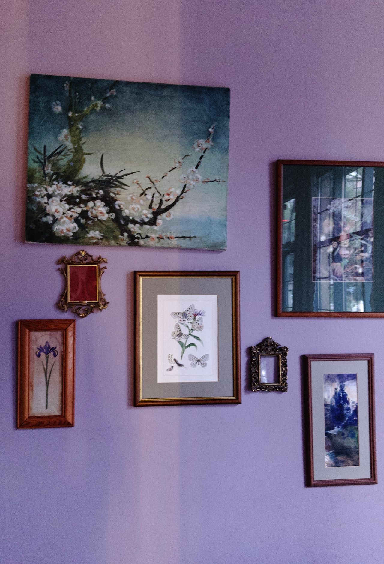
Different frame sizes mixed on a single wall — Photo: Maryam Kamavova, via Pexels
Different sizes look rich and collected when one size clearly leads. Make your largest frame the anchor and give it about half of the total display area — if the whole cluster covers 40 by 30 inches, the anchor can be around 20 by 24. Add two or three medium frames and two or three small ones around it. The size steps should feel like a staircase (large, medium, small), not a cliff (one giant frame plus five tiny ones).
Tame the mix with alignment. Line up the outer edges of the cluster — keep the top edges level, or the bottom edges level, or both — and the size differences stop looking random. If you own many tiny frames, group three or four of them into one tight mini-cluster with 1-inch gaps; the mini-cluster then acts as one medium piece in the bigger layout. Never scatter small frames evenly among big ones — that is what makes a wall look messy.
9. Mixing Frame Styles and Colors

Vintage art pieces in decorative mixed frames — Photo: byramblc, via Pexels
Limit yourself to two or three frame finishes — for example black, natural oak, and white. Three finishes feel collected; five finishes feel chaotic. Keep wood tones in one family: warm woods (oak, walnut) together, or cool woods (ash, gray-washed) together, never both. A 70/30 split works well: about 70 percent of frames in your main finish, 30 percent in the accent finish.
The real unifier is the mat. Put the same white or cream mat inside every frame, and suddenly black metal, wood, and even gold frames look like they belong together — the eye reads the matching mats before it reads the frames. Keep mat widths similar too (2 to 3 inches is standard). If a piece has no mat, give it a wider frame instead so its border weight matches the matted pieces. Repeat each finish at least twice so no single frame looks like a stranger.
10. Choosing What Goes Inside the Frames
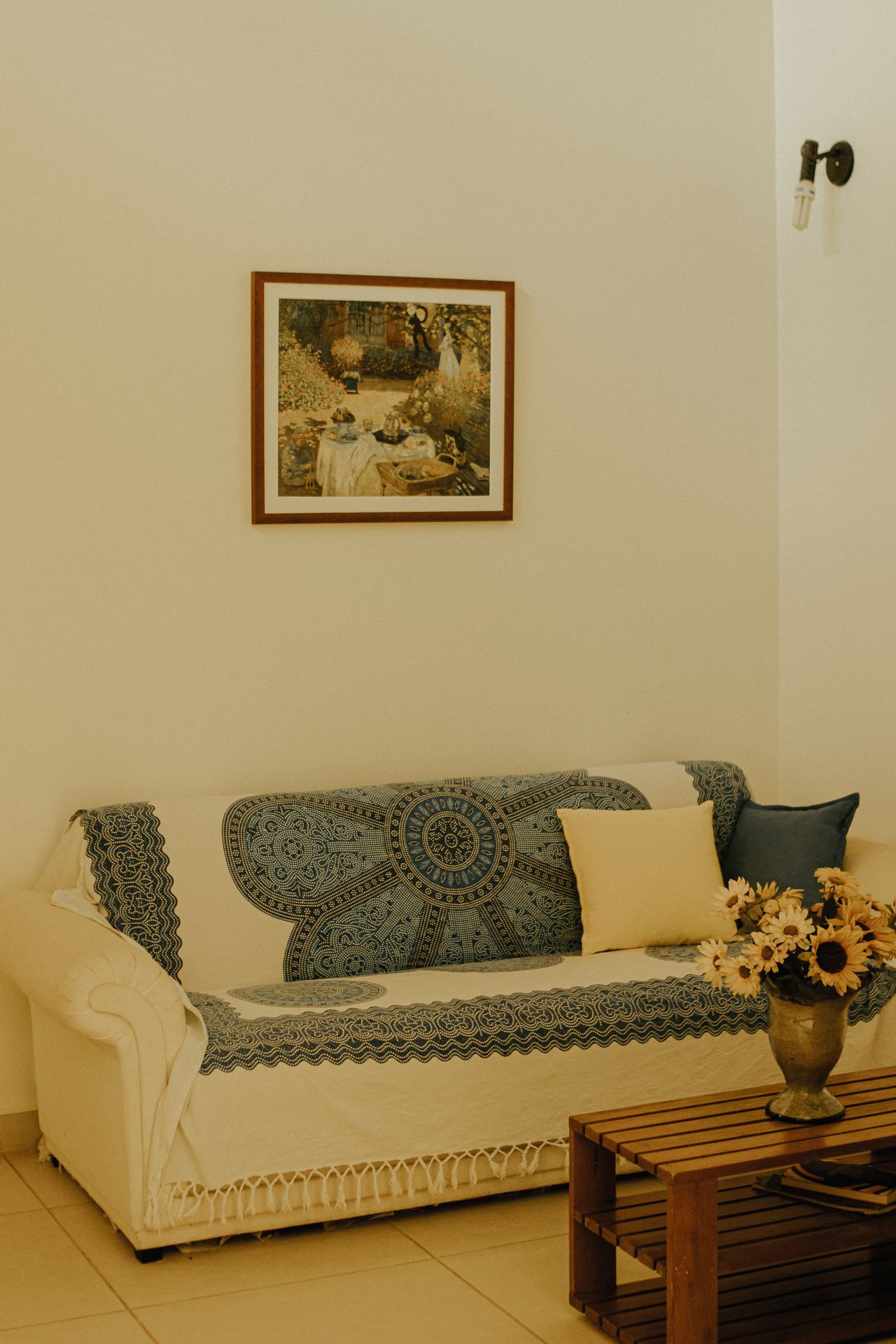
Framed artwork styled above a living room sofa — Photo: juliane Monari, via Pexels
The best displays mix three things: personal photos, art prints you love, and one or two non-photo pieces like a small mirror, a woven textile, or a framed map. The mirror is a designer trick — it bounces light around the room and breaks up a wall of rectangles. Stick to a color story of three to four colors across all the art; pull those colors from your rug or sofa so the wall feels stitched into the room. Our fall living room ideas show how swapping two or three prints for seasonal ones refreshes the whole display each autumn.
Think about glass and print finish while you choose. Matte or lustre prints cut glare under lamps and windows; glossy prints shine like mirrors under the same light. If a frame sits opposite a window, choose matte glass or a non-glare acrylic. And vary the subject scale: pair one close-up (a face, a flower) with one wide scene (a landscape, a street) so the wall has rhythm. Odd numbers of photo subjects — three portraits, five travel shots — group more pleasingly than even numbers.
11. Tools You Really Need
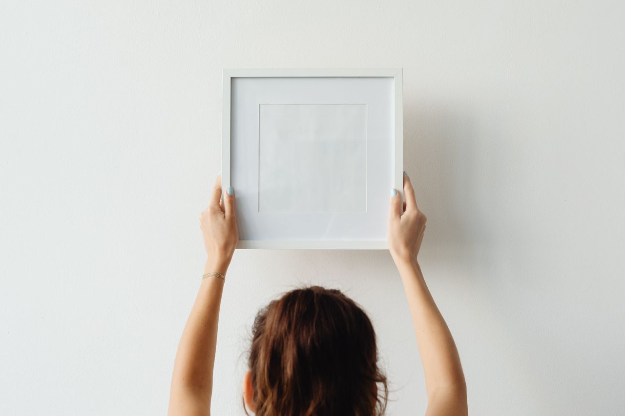
Hanging a frame on a white wall — Photo: kaboompics, via Pexels
You need less than you think: a tape measure, a pencil, a roll of painter's tape, a small spirit level (your phone's level app works in a pinch), a hammer, and picture-hanging hooks rated for your frames' weight. Add a step ladder if any frame goes above your reach, and a roll of kraft paper for the templates in idea 4. That is the whole kit — about fifteen dollars of basics if you own nothing yet.
Two extras earn their keep on big projects. A laser level throws a straight line across the whole wall, which makes grids and long rows ten times faster. A stud finder matters only for heavy pieces: anything over 20 pounds deserves a screw into a stud, not just drywall. Keep a small dish or magnetic tray for nails and hooks as you work — crawling around looking for a dropped hook on a rug is a rite of passage you can skip.
12. Nails, Hooks, and Different Wall Types
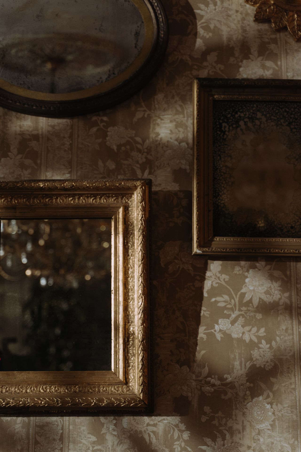
Frames hung securely on a wall — Photo: cottonbro studio, via Pexels
Match the hanger to the wall. In drywall, angled picture hooks (the kind with a tiny nail that drives in at 45 degrees) hold 20 to 50 pounds each and leave only a pinhole. For frames over 15 pounds, use two hooks spaced 16 inches apart so the weight spreads. In plaster walls, drill a small pilot hole first — hammering straight into plaster can crack it in a spiderweb. In concrete or brick, you need a masonry drill bit and a plastic anchor; a regular nail will just bend.
Renters have excellent no-hole options. Adhesive picture-hanging strips hold up to 16 pounds per set of four strips, and they pull off cleanly when you move — follow the package's wait time (usually one hour) before hanging the frame, or they will fail. For heavy mirrors in rentals, a leaning floor mirror or a picture ledge (idea 7) beats any adhesive. Whatever you use, check the weight rating on the package and weigh your frame on a bathroom scale first — most people guess frame weight wrong by half.
13. Mistakes That Ruin the Look
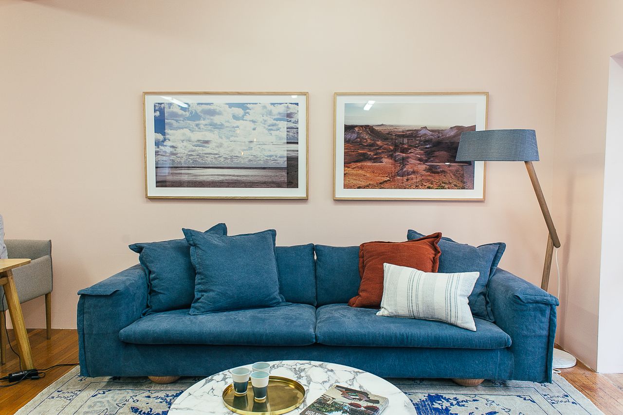
Framed artwork hung at the right height above a sofa — Photo: Rachel Claire, via Pexels
The most common mistake is hanging everything too high — frames floating near the ceiling, disconnected from the furniture below. If your display feels floaty, move the whole cluster down two to three inches and watch it settle. The second mistake is uneven gaps: one 1-inch gap next to one 4-inch gap makes even expensive art look sloppy. The third is scale: a 24-inch-wide cluster centered on a 10-foot wall looks lost. Remember the two-thirds rule from idea 1, and when in doubt, go bigger.
Then check the details. Run your level across every frame after hanging — frames tilt when you step back and admire them, so check twice. Keep frames out of direct TV sightlines, because glass glare from a screen ruins the art at night. And resist filling every inch: a little empty wall around the cluster is what makes it look like a display instead of wallpaper. If something still feels off, take a phone photo — the camera flattens the scene and exposes crooked lines and bad gaps instantly.
14. Lighting Your Frames
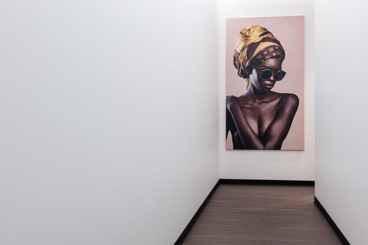
Artwork glowing under good light in a bright hall — Photo: Max Vakhtbovych, via Pexels
Good light turns a nice display into a stunning one. Battery-powered picture lights mount right on the frame or the wall 4 to 6 inches above it, and a 6-to-12-inch light suits most frame sizes — no wiring needed. If you have track or ceiling spots, aim them at a 30-degree angle from about 2 to 3 feet out from the wall; that angle lights the art evenly without harsh glare on the glass. Use warm bulbs around 2700K — they make skin tones in photos and warm art colors glow.
Protect the art from the wrong light, too. Direct sunlight fades prints and photos within one to two years, so never hang prized pieces on a wall that gets hard afternoon sun — or use UV-filtering glass, which blocks about 97 percent of fading rays. You do not need to light every frame; lighting the anchor piece and one or two favorites creates a natural focal point and saves battery changes. Wipe picture-light lenses monthly, because a dusty lens dims the beam more than you would expect.
Final Thoughts
A great wall of frames is not about expensive art or perfect taste. It is about three numbers — 57 inches, 2 to 3 inches, and 6 to 8 inches — plus one afternoon of planning on paper. Hang the anchor first, keep your gaps even, and step back often. If a layout feels wrong, it is almost always height or spacing, and both take five minutes to fix. Start with the wall you see most, gather frames you already own, and build from there. Your living room will feel finished in a way no single big painting can match.
FAQs
How far apart should frames be on a gallery wall?
Keep 2 to 3 inches (5 to 8 cm) between frames. Use smaller gaps for small frames and wider gaps for large ones, and keep every gap the same.
At what height should I hang a gallery wall?
Center the whole display at 57 to 60 inches from the floor. Above a sofa, leave 6 to 8 inches between the sofa back and the bottom frame.
How do I mix frame sizes and styles without it looking messy?
Start with one large anchor frame, use two or three frame finishes at most, and unite everything with the same white mat inside each frame.
Can I hang frames on a rental wall without nails?
Yes. Adhesive picture-hanging strips hold up to 16 pounds per set of four and come off cleanly. Picture ledges are another renter-friendly option.
Do all my frames need to match?
No. Matching frames look calm and modern, but mixed frames look collected and personal. Just keep the gaps even and the color palette limited.
How do I mark exactly where each nail goes?
Trace each frame on kraft paper, tape the paper on the wall, and hammer through the paper at the hanger spot. Or dab toothpaste on the hanger and press it to the wall.
Should I choose glossy or matte photo prints?
Matte or lustre prints look best because they cut glare under room light. Save glossy prints for small frames away from windows and lamps.
How many frames are too many?
For one wall, 3 to 9 frames is the sweet spot. Fewer than three looks accidental; more than nine is hard to balance without a plan.
Gallery

Framed photographs lining a gallery hallway — Photo: Matheus Viana, via Pexels
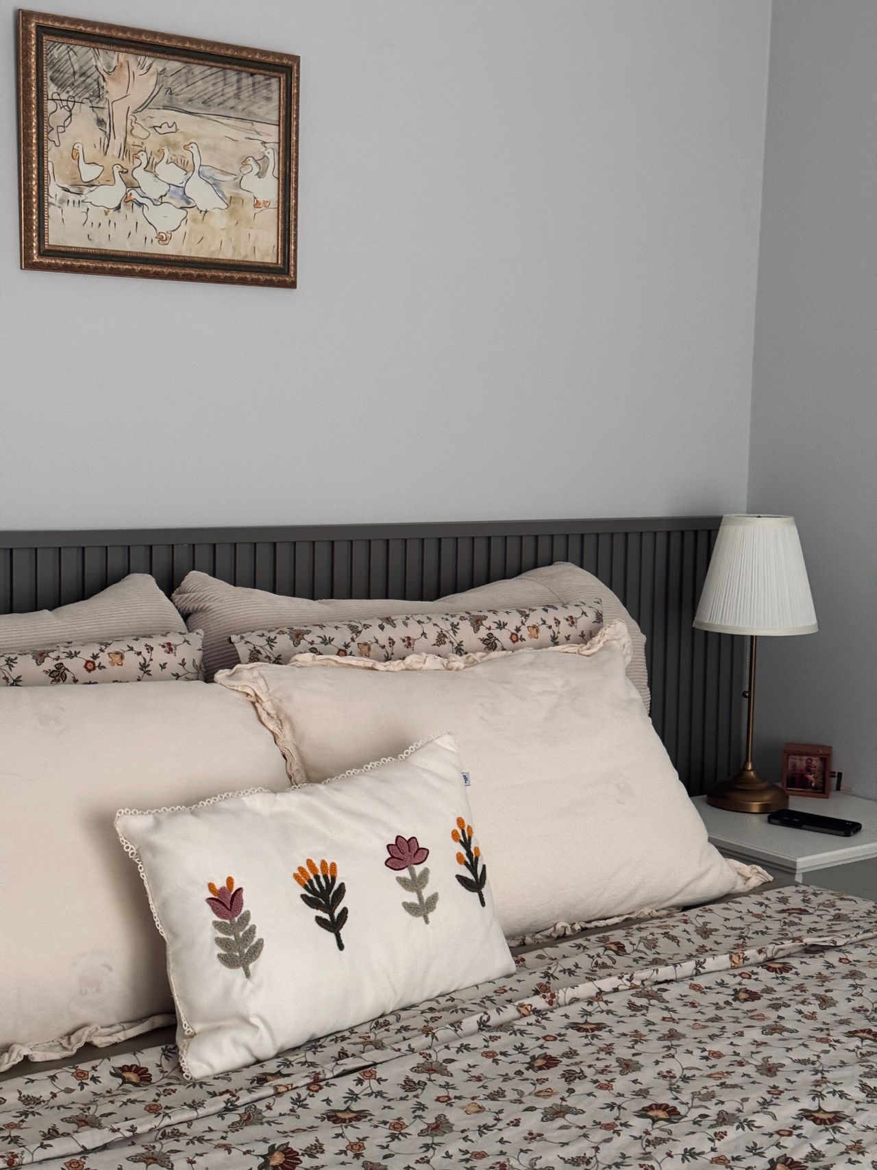
Framed wall art above a bed in a cozy bedroom — Photo: Saliha Büyükkaya Gülhan, via Pexels
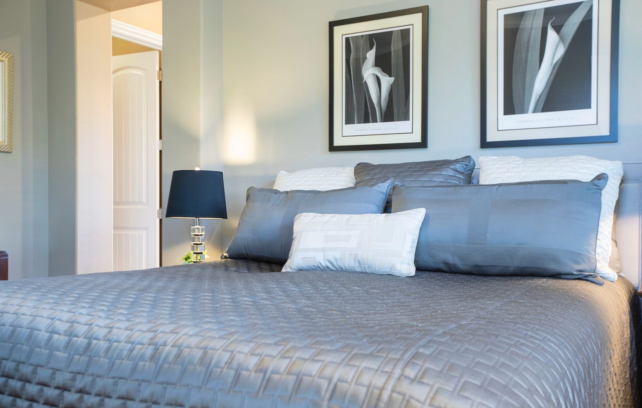
Two framed pictures hung above a gray bed — Photo: Stephen Leonardi, via Pexels

Hand tools laid out for a frame-hanging project — Photo: Maria Mileta, via Pexels
Sources
- Apartment Therapy — the three key measurements for hanging artwork (57–60 inches high, even gaps, 6–8 inches above furniture): https://www.apartmenttherapy.com/the-three-measurements-you-need-to-know-when-hanging-artwork-224943
- American Frame — step-by-step guide to building a framed display from the center outward: https://www.americanframe.com/pictureframeblog/your-great-wall-how-to-create-a-gallery-wall
- E-A-A — apartment guide with spacing adjusted by frame size and floor-first planning: https://www.e-a-a.com/how-to-create-a-gallery-wall-in-your-apartment/
- Fab-Art — seven wall-art layouts with exact spacing measurements: https://www.fab-art.co/blogs/news/7-living-room-wall-art-layouts-with-exact-spacing-measurements

No comments:
Post a Comment