The bed takes up more space than any other piece of furniture in your bedroom, so the colors you put on it decide how the whole room feels. The right bedding color schemes do not just look pretty in photos. They make the room feel calmer, help your wall color look its best, and make getting dressed in the morning feel a little more peaceful. The good news is that you do not need a designer to get it right. You only need a pairing that works and a few simple rules.
Below you will find ten tried and true pairings, from crisp navy and white to soft sage green and warm terracotta. For each one, I will tell you the exact shades to look for, which wall colors and furniture finishes it loves, and who it suits best. One question people ask again and again is whether bedding has to match the walls. It does not. It only has to get along with them, and every scheme below shows you how. Most duvet cover sets cost between $25 and $60, so a whole new look is cheaper than one can of paint.

Photo: Pexels
Table of Contents
- 1. White and Warm Gray
- 2. Navy and Crisp White
- 3. Soft Sage Green
- 4. Terracotta and Cream
- 5. Blush Pink and White
- 6. Charcoal Gray
- 7. Soft Blue and Warm Beige
- 8. All-Neutral Layers
- 9. Black and White
- 10. Earthy Mustard Tones
- Frequently Asked Questions
- Final Thoughts
- Sources
- Gallery
1. White and Warm Gray
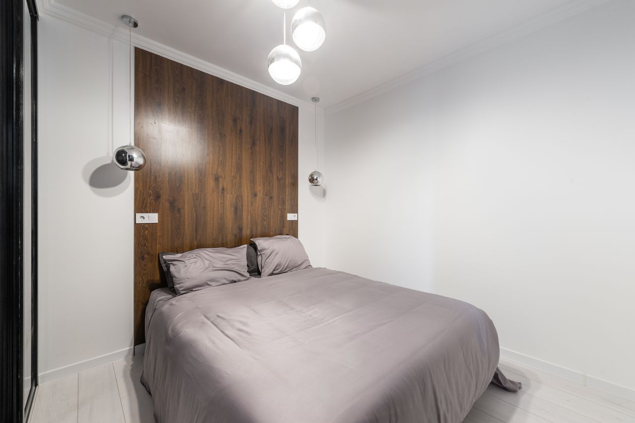
Photo: Pexels
This is the pairing hotels use, softened for home. Start with white sheets, then add a warm gray duvet cover, the kind of gray with a hint of brown in it, often called greige. Warm gray keeps white from feeling cold or plain, and white keeps the gray fresh. Add one more layer, like a light gray throw folded at the foot of the bed, and the whole bed looks calm and finished without a single bold color anywhere.
It loves warm white or soft beige walls and medium wood furniture, like oak or walnut. Black metal lamps or picture frames add just enough contrast. This scheme suits almost anyone, but it is perfect if you rent and cannot paint, or if your room gets little sunlight and needs all the brightness it can get. Light bedding is also the oldest trick for a tight space, the same idea behind these small bedroom ideas for couples that make a little room feel twice its size.
2. Navy and Crisp White
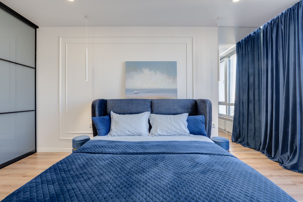
Photo: Pexels
Navy and white is the smart shirt of bedding color schemes: classic, clean, and hard to get wrong. Use a navy duvet or quilt as the main block of color, then break it up with white sheets and white pillowcases so the bed does not feel heavy. A thin white stripe or a small navy pinstripe on the sheets adds a tailored touch. This is a great scheme for anyone who wants color but fears waking up in six months and hating it.
It pairs best with white or very light gray walls, which make the navy look rich instead of dark. Light wood floors and furniture keep it breezy, while brass or warm gold lamps stop it from feeling cold. Navy suits guest rooms beautifully because almost everyone finds it restful, and it works for both modern and traditional rooms. One warning from real life: navy shows white lint and light pet hair, so keep a lint roller in the nightstand drawer.
3. Soft Sage Green
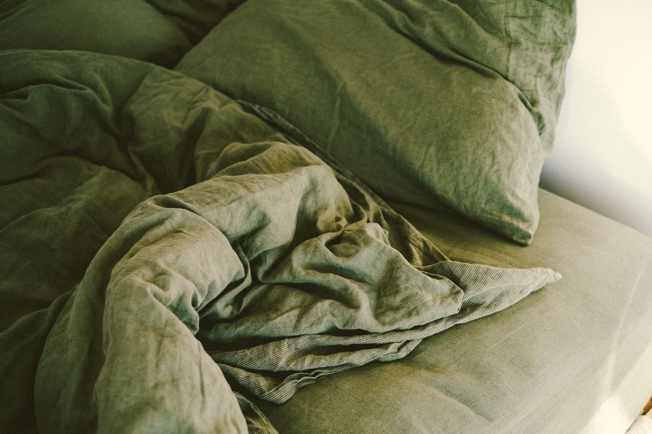
Photo: Pexels
Sage is a soft, grayish green that behaves almost like a neutral. A sage duvet cover in washed linen looks relaxed from day one, wrinkles and all, and it brings a quiet, garden feel into the room. Layer it with cream or warm white sheets so the green stays soft, and add a slightly deeper green cushion if you want more depth. Sage is one of the easiest colors to sleep next to because it never shouts.
Sage loves warm white walls, light oak and rattan furniture, and brass or black accents. If your walls are already a pale green, choose bedding one or two shades deeper so the bed stands out instead of disappearing into the wall. This scheme suits plant lovers, cottage and farmhouse fans, and anyone whose bedroom gets warm afternoon sun, because green reads cool and keeps the room feeling fresh at the end of the day.
4. Terracotta and Cream
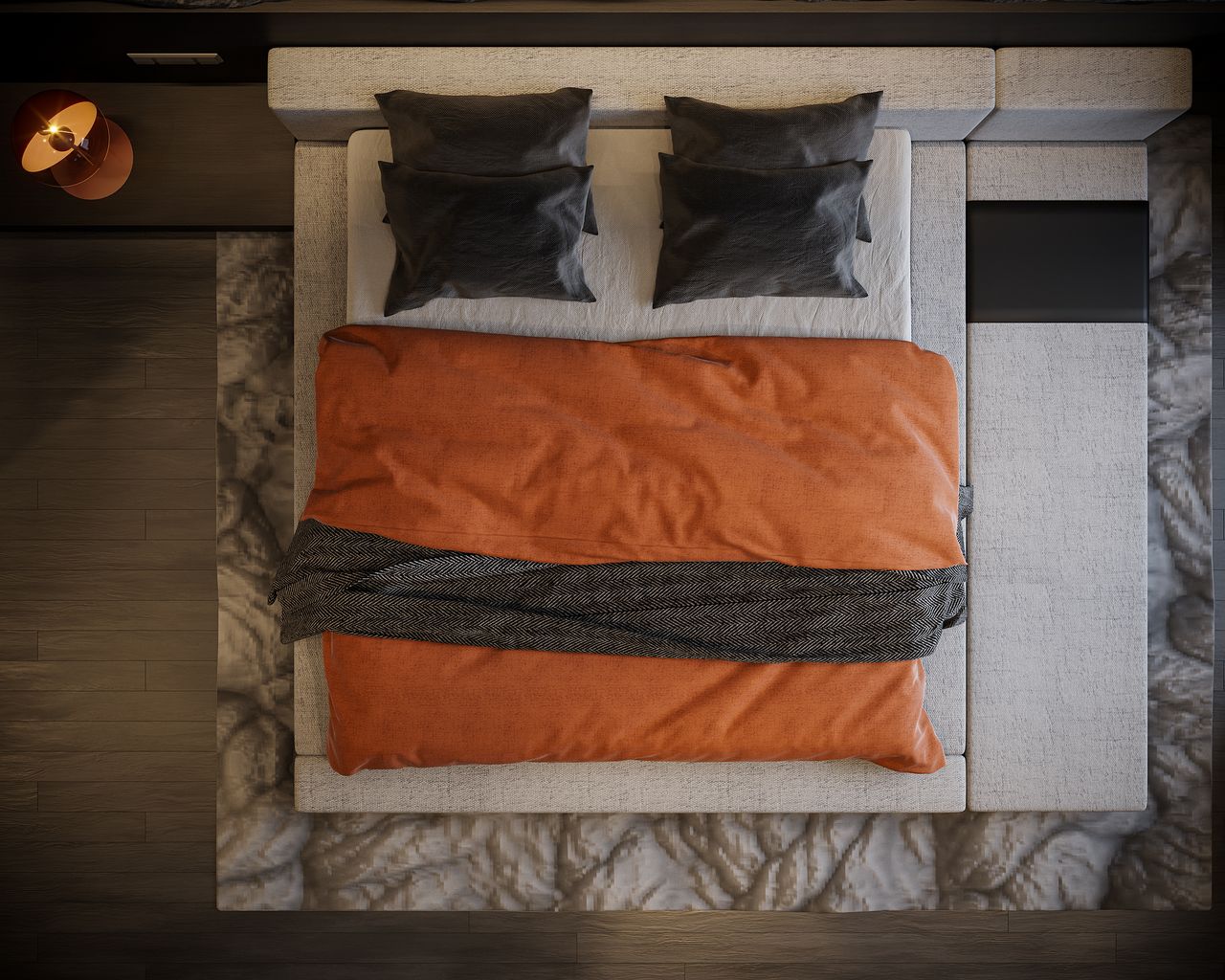
Photo: Pexels
Terracotta is a warm, earthy orange, like a clay pot that has sat in the sun. On a bed it feels cozy without going dark, especially when you soften it with cream sheets and a cream or oatmeal throw. The trick is to let terracotta be the only strong color. Keep everything else quiet: plain cream, natural linen, a little black or charcoal if you want an edge, as in the photo above.
This pairing glows against warm white, sand, or pale clay walls, and it is made for wood furniture, woven baskets, and leather accents. It suits boho, Mediterranean, and Southwestern styles, and it is a gift for north facing rooms that always feel a bit cold and blue. Terracotta also hides everyday dust and light stains better than pale colors, which makes it a practical pick for busy homes and homes with dogs.
5. Blush Pink and White
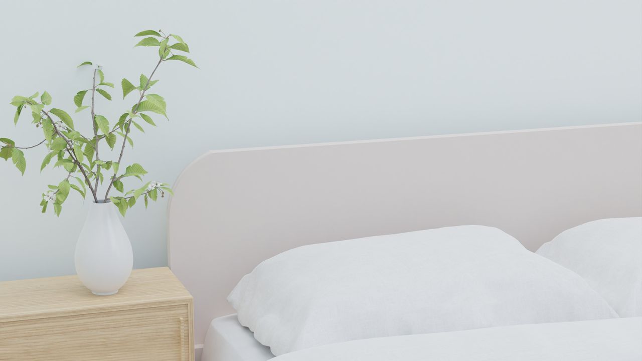
Photo: Pexels
Blush is pink that has grown up: pale, dusty, and soft rather than sweet. The easiest way to use it is as an accent against white bedding, through a blush throw, two blush pillow shams, or a blush upholstered headboard like the one in this photo. Keeping the duvet white stops the room from tipping into nursery territory, and the pink warms up the white so the bed feels soft instead of stark.
Blush pairs well with white, light gray, or pale greige walls and with light wood, white, or gold toned furniture. A little sage green or gray in the room keeps it feeling grown up. This scheme suits anyone who wants a gentle, romantic room, and it is lovely in a guest room because it feels welcoming to almost every visitor. Choose dusty, muted blush over bright pink and it will never look childish.
6. Charcoal Gray
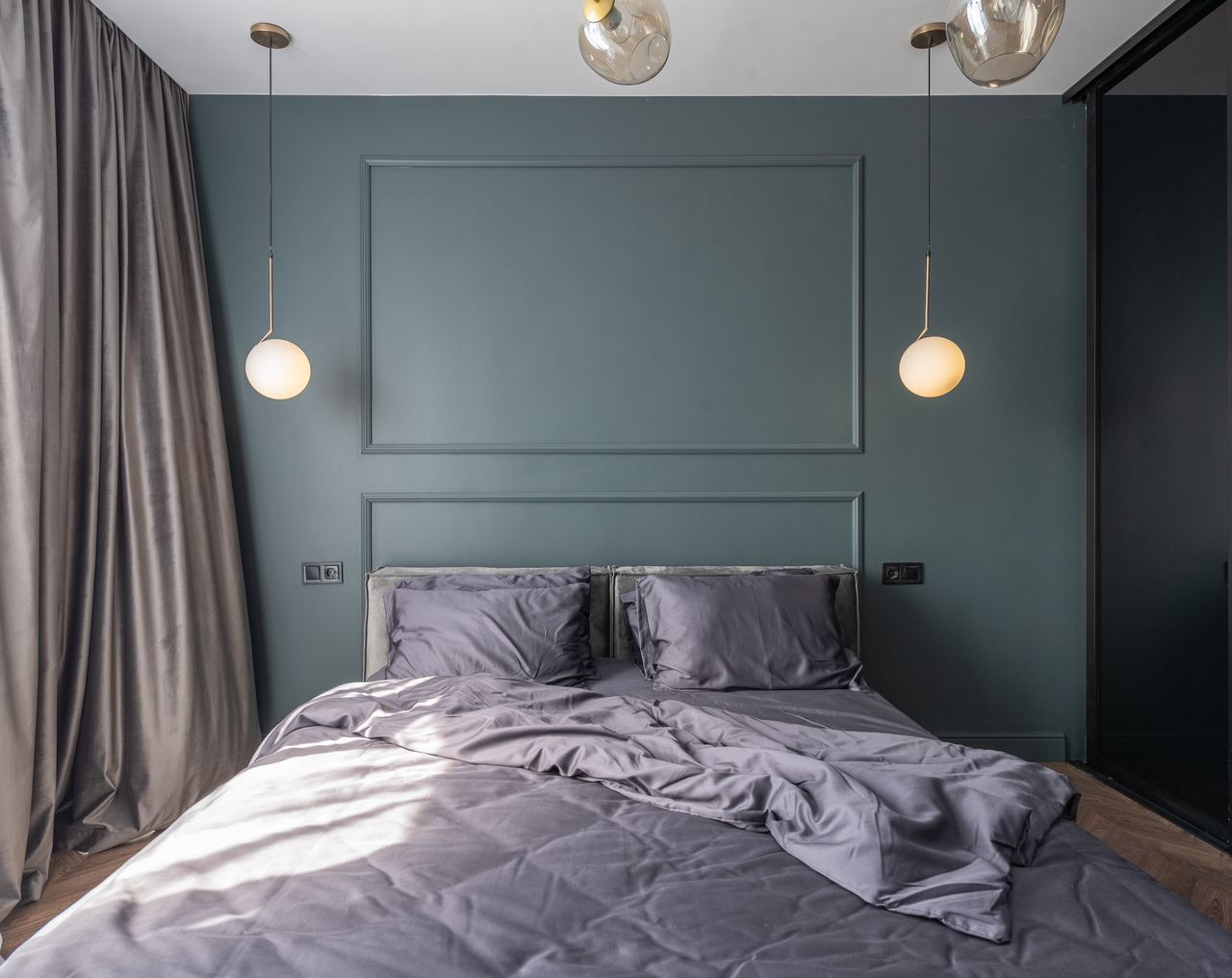
Photo: Pexels
Charcoal bedding makes a bed feel like a cocoon. It is dramatic, calm, and surprisingly restful, because dark colors tell your brain the day is over. To keep it from swallowing the room, layer charcoal with one lighter note: white sheets peeking out at the top, a light gray throw, or pale pillowcases. A fabric with a soft sheen, like sateen or washed linen, catches the light and stops the bed looking flat.
Charcoal works with white walls for strong contrast, or with deep green, navy, or warm wood paneling for a moody, boutique hotel feel. It suits modern rooms, older teens, and anyone who sleeps best in a dark room. Be honest about the trade offs before you buy: charcoal shows lint, dust, and pet hair more than mid tones, and dark dyes fade faster in hot washes, so wash it cold and turn the covers inside out.
7. Soft Blue and Warm Beige
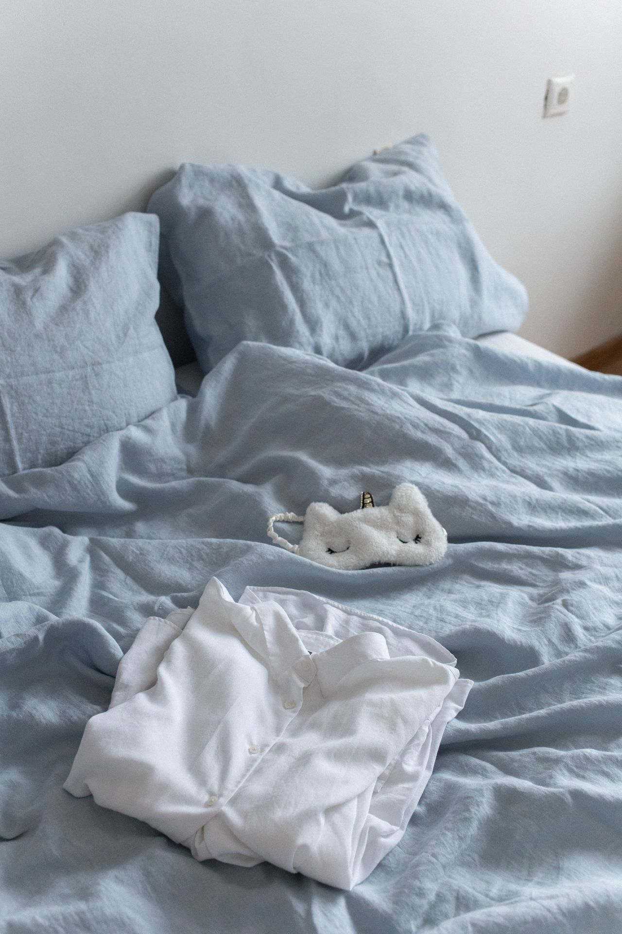
Photo: Pexels
Blue and beige is the relaxed cousin of navy and white. Think dusty blue, sky blue, or faded denim for the duvet, then warm it up with beige, sand, or oatmeal in the sheets, throw, and rug. The beige stops the blue from feeling chilly, and the blue stops the beige from feeling dull. Washed linen in both colors gives you that easy, coastal look without a single seashell or anchor in sight.
This pairing loves beige, cream, or soft white walls and natural wood furniture, especially pine, oak, and rattan. It is one of the best choices for a coastal, cottage, or Scandinavian room, and for hot climates, because blue reads cool to the eye even when the fabric is warm. If your room has warm wood floors, this scheme will tie itself together with almost no effort from you.
8. All-Neutral Layers
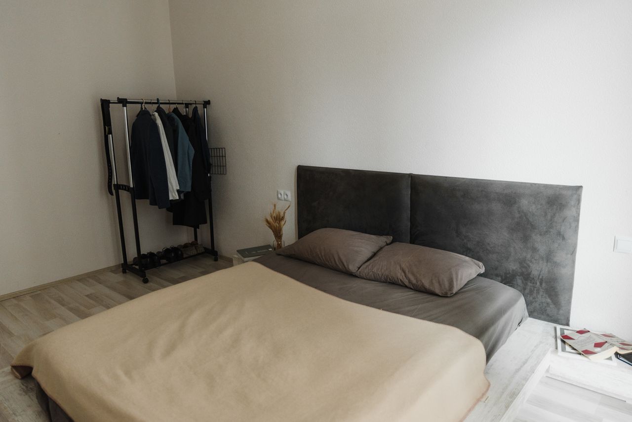
Photo: Pexels
An all-neutral bed uses no real color at all, just layers of white, cream, oatmeal, beige, taupe, and soft gray. The secret is texture, not color. Mix a smooth cotton sheet, a nubby linen duvet, a waffle or quilted throw, and one chunky knit blanket, and the bed looks rich instead of plain. Keep each layer a slightly different shade so your eye can see where one ends and the next begins.
Neutrals go with every wall color and every furniture finish, which makes this the safest scheme of all if you like to change your room often. Swap one cushion or throw and the whole bed feels new. It suits minimalists, small rooms, and anyone who gets bored and redecorates around the bed. One practical bonus people mention often: neutral sets from different brands still mix well together, so you can build the bed slowly, piece by piece.
9. Black and White
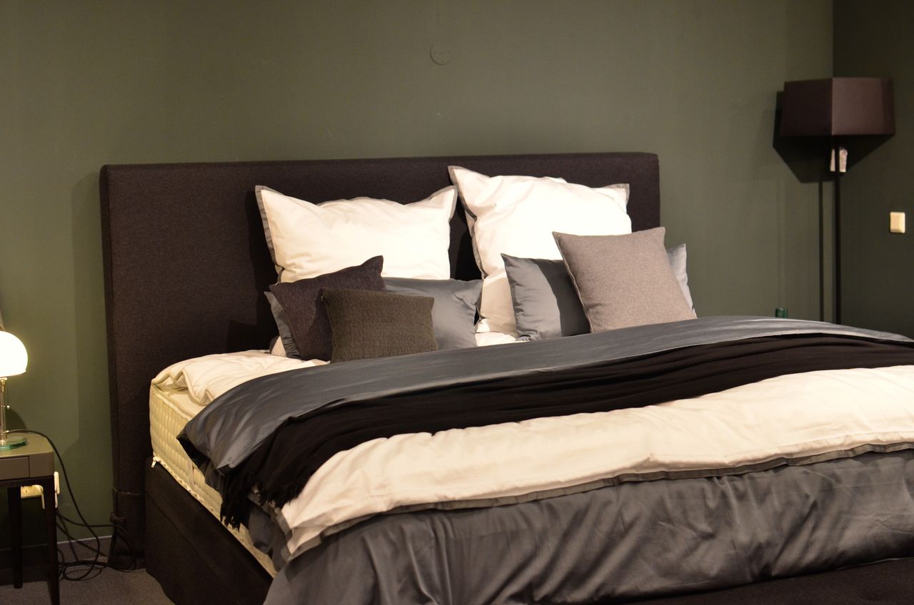
Photo: Pexels
Black and white is bold, graphic, and always in style. The balanced way to do it is a white duvet as the base, then black in smaller doses: a black throw across the foot, black pillow shams, or a black and white stripe or check. Gray is your peacekeeper here, softening the contrast so the bed looks smart instead of harsh. The bed in this photo shows the recipe well, white on top, black and charcoal layered through the middle.
This scheme suits modern, Scandinavian, and hotel style rooms, and it pairs with almost any wall color, from white to sage to a daring black accent wall behind the headboard. Wood furniture warms it up; chrome and black metal keep it sharp. Finish both sides of the bed the same way for that crisp hotel look, with matching lamps and simple styling like the setups in our nightstand decor ideas. If pure contrast feels too much, swap the black for charcoal and you get the same idea, gentler.
10. Earthy Mustard Tones

Photo: Pexels
Mustard is yellow with the brightness turned down and a little brown mixed in, and on bedding it feels like bottled sunshine. It is best used as the warm accent in a calm room: a mustard duvet with cream sheets, or a white bed with a mustard throw and two mustard cushions. Linen and cotton show this color at its best, with a matte, slightly rumpled finish that keeps it earthy instead of shiny.
Mustard loves warm white, cream, and soft gray walls, and it is wonderful with mid tone wood, black metal, and deep green plants. It suits boho, mid century, and eclectic rooms, and it earns its keep in dark or north facing bedrooms that need warmth more than anything. One real world tip: mustard and gray are an especially forgiving pair, so start there if a full mustard duvet feels like too big a step.
Frequently Asked Questions
Should my bedding match my wall color?
No, and it usually looks better when it does not match exactly. Bedding in the exact same color as the walls makes the bed disappear and the room feel flat. Instead, pick a shade that gets along with the wall: one or two steps lighter or darker, or a friendly contrast like navy bedding against white walls. If your walls are a strong color, keep the bedding calm and neutral. If your walls are pale, the bed is your chance to add the color.
What are the best bedding color schemes for a small bedroom?
Light ones. White with warm gray, all-neutral layers, and soft blue with beige are the safest picks for a small room, because pale colors bounce light around and make the bed look airy instead of bulky. If you love a dark color, use it in the throw and cushions only, and keep the duvet light. A low contrast bed also makes the whole room feel calmer and larger than a busy, high contrast one.
Which bedding colors help you sleep best?
Most people sleep best surrounded by soft, muted colors: sage green, dusty blue, warm gray, and gentle neutrals. These shades feel quiet to the eye and are linked in study after study with a calm mood. Bright red, neon shades, and very busy patterns can feel energizing, which is lovely in a kitchen and less helpful at midnight. Whatever color you choose, a matte fabric like linen or brushed cotton feels more restful than a shiny one.
Do dark sheets and duvet covers fade or show lint?
Yes, a little more than pale ones. Dark dyes, especially navy, charcoal, and black, fade slowly in hot water and strong sun, and they show lint, dust, and light pet hair. You can slow all of this down: wash dark bedding cold, inside out, with a gentle detergent, and dry it on low heat. If you have a pet that sheds light fur, a mid tone like sage, taupe, or dusty blue will save you a lot of lint rolling.
How do I mix two or three bedding colors without a mess?
Use the 60-30-10 rule that designers swear by. Let one color cover about 60 percent of the bed, usually the duvet. Give the second color about 30 percent, in the sheets and pillowcases. Save the last 10 percent for a small pop, one cushion or a folded throw. Two colors plus white almost never fails. And pull at least one of your colors from something already in the room, a rug, a curtain, or a picture, so the bed feels like it belongs there.
Final Thoughts
The best bedding colors are the ones that make you exhale when you walk into the room at night. Start with the feeling you want: crisp and hotel fresh, soft and earthy, or dark and cocoon like. Then pick one scheme from this list and copy it closely the first time, duvet, sheets, and one throw. A full set in queen size often costs less than $50, so it is one of the cheapest full room makeovers you can buy.
Once the bed is right, the rest of the room usually falls into place around it, because you finally have a palette to match everything else to. Keep your second favorite scheme in mind for a seasonal swap, light and airy for summer, deeper and warmer for winter, and your bedroom will feel new twice a year for very little money. Sleep well.
Sources
- Sleep Aid Factory — "Bed Sheet Color Combinations: How to Create Stylish, Soothing Bedding": https://www.sleepaidfactory.com/bed-sheet-color-combinations/
- Ecosa — "10 Bedroom Linen Colour Combinations to Try": https://www.ecosa.co.nz/blog/post/bedroom-linen-ideas.html
- Mattress Nut — "Best Color for Bed Sheets: Crafting the Mood for Your Bedroom": https://www.mattressnut.com/best-color-for-bed-sheets/
- Storables — "Should Your Bedding Match Your Wall Color? Designers Explain": https://storables.com/interior-design/should-your-bedding-match-your-wall-color-designers-explain/
Gallery

Photo: Pexels
Photo: Pexels

Photo: Pexels

No comments:
Post a Comment