Shopping for a vintage gown is exciting until the color question stops you cold. The dress is beautiful on the rack, the price is fair, and the label says it is a rare find from decades ago, but when you hold it up to your face, something feels off. Your skin looks tired, or the dress seems to wear you instead of the other way around. That feeling is almost always about color, not about you. A vintage gown color that flatters you starts with your skin tone, not with the dress's story, and once you know which shades lift your face, choosing becomes much simpler.
Readers ask the same questions before they buy: will this pale shade wash me out, does a deep jewel tone suit me, and should I buy a rare piece even if the color is not quite right? This guide answers all three in plain words. You will learn how to find your undertone in five minutes, which color families suit warm, cool, and neutral skin, how to test a gown in real light, and when to walk away from a so-called archive piece that does not flatter you. Silhouette matters too, and we cover it second, because a perfect shape in the wrong color still washes you out, while the right color can make a simple shape look stunning.

A flowing red chiffon halter gown with a wide skirt, shown holding out the fabric — Photo via Pexels
Table of Contents
- 1. Find Your Undertone Before You Shop
- 2. Cool Skin: Deep Jewel Tones and True Blues
- 3. Warm Skin: Rich Reds, Golds, and Earth Tones
- 4. Pale Shades: When Ivory and Blush Wash You Out
- 5. Vintage White: Pretty on the Rack, Risky on the Skin
- 6. Greens and Olive: Jewel, Sage, or Muddy?
- 7. Bright Colors: Yellow, Coral, and Bold Lace
- 8. Gold, Silver, and Metallic Gowns
- 9. Prints and Patterns in Vintage Gowns
- 10. When a Rare Piece Should Not Override Fit and Color
- Frequently Asked Questions
- Final Thoughts
- Sources
- Gallery
1. Find Your Undertone Before You Shop

An emerald green halter dress with silver heels, worn outdoors — Photo via Wikimedia Commons
Your skin tone is the color you see on the surface, but your undertone is the quiet color underneath it, and undertone is what decides whether a gown shade flatters you. The simplest test takes one minute: look at the veins on the inside of your wrist in daylight. If they look blue or purple, you likely have a cool undertone. If they look green, you likely have a warm undertone. If you cannot tell, or they look like a mix, you likely have a neutral undertone, which means you can wear a wider range of shades. A second test helps too: hold a pure white cloth and then a cream cloth next to your face, and notice which one makes your skin look healthier and more even. White usually favors cool skin, while cream favors warm skin.
Do this test before you fall in love with any gown, because it saves you from the most common vintage mistake: buying a color that looked lovely on a model or a mannequin but fights your skin. The emerald dress in the photo is a good example of why undertone matters more than depth of color alone. Emerald is a jewel tone with a cool edge, and it glows on many cool and neutral skins, while a warmer green, like olive, suits warm skin better. Once you know your undertone, you can walk into a vintage shop with a short list of families to try first, instead of trying every dress on the rack and hoping one works. That short list is what the rest of this guide builds for you.
2. Cool Skin: Deep Jewel Tones and True Blues

A navy sequin halter gown with pearl fringe, photographed crouching on a red carpet — Photo via Pexels
If your undertone is cool, your best gown shades are usually deep, clear colors with a blue or purple base: navy, sapphire, emerald, burgundy with a blue edge, and true red rather than orange-red. The navy sequin gown in the photo shows why these shades work. Navy is softer than black in photos, it suits evening light, and the pearl fringe adds brightness near the face without adding a second color story. Cool skin also handles silver jewelry beautifully, so silver heels, silver earrings, or a silver clutch will usually look more natural with a cool-toned gown than gold will.
Watch out for two traps with cool skin. The first is a warm, yellow-based shade, like mustard or orange-red, which can make cool skin look tired or blotchy. The second is a very pale, warm cream, which can blend into cool skin and wash it out. If you love a warm shade, try it in a deeper version — a deep rust instead of a bright orange, or a wine red instead of a tomato red — and test it in daylight against your face before you commit. For more formal gown ideas in these deep shades, see our halter neck formal dresses guide, which covers satin, chiffon, and sequins in jewel tones. Cool skin rewards depth and clarity, so pick a shade that looks crisp, not muddy, next to your face.
3. Warm Skin: Rich Reds, Golds, and Earth Tones

A deep red velvet and satin vintage evening gown on a mannequin — Photo via Wikimedia Commons
If your undertone is warm, your best gown shades are usually rich colors with a golden or yellow base: warm red, burgundy with a brown edge, gold, bronze, olive, and deep coral. The vintage gown in the photo is a perfect warm-skin lesson. Its deep red velvet bodice and satin skirt carry warmth in the fabric itself, so the color looks alive rather than flat, and gold jewelry would finish it naturally. Warm skin also suits earth tones that cool skin often struggles with, like camel, chocolate, and rust, because those shades share the same golden base as the skin.
The trap for warm skin is the opposite of the cool-skin trap: icy, blue-based shades, like ice blue, stark white, or a very cool pink, can make warm skin look gray or tired. If you love a cool shade, try a warmer version of it — teal instead of ice blue, or a warm rose instead of a bubblegum pink — and check the shade in daylight, not just under shop lights. Vintage shops often use warm indoor lighting, which flatters warm shades and hides how a cool shade will really look, so step near a window or door with the dress held to your face. A warm shade that makes your eyes look brighter and your skin look even is the right one, even if it is not the shade you expected to love.
4. Pale Shades: When Ivory and Blush Wash You Out
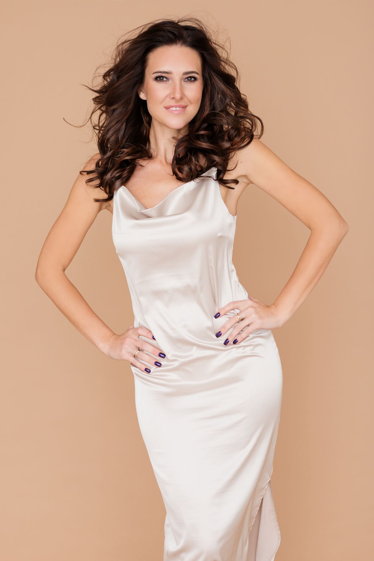
An ivory satin slip dress with a cowl neckline and thin straps — Photo via Pexels
Pale shades are the biggest washout risk in vintage shopping, and ivory is the classic example. The ivory satin dress in the photo is beautiful, but on very fair skin it can blend into the complexion, especially in photos, so the dress looks lovely and the wearer looks faded. The same risk applies to blush pink, pale champagne, and light gray. The test is simple: hold the dress to your face and look at your eyes, not at the dress. If your eyes look brighter and your skin looks even, the shade works. If your face looks flat or tired, the shade is too close to your skin tone, no matter how pretty the dress is on its own.
You do not have to give up pale shades completely. Try a deeper version of the same family — a warm champagne instead of a pale ivory, a dusty rose instead of a baby pink, or a soft gold instead of a pale cream — and add contrast near the face with earrings, a darker lip color, or a wrap in a deeper tone. Satin makes the washout risk higher, because its shine reflects light onto the skin, while matte fabrics like crepe or velvet are more forgiving. If you are buying a pale vintage gown for photos, take a test photo in daylight before you commit, since cameras exaggerate washout more than mirrors do. A pale gown should frame you, not erase you.
5. Vintage White: Pretty on the Rack, Risky on the Skin

A white 1950s vintage dress with a small blue print and blue waist panels, on a mannequin — Photo via Wikimedia Commons
Many vintage dresses come in white or near-white, and white is the hardest shade to judge on a rack because it looks clean and classic no matter who holds it. The 1950s dress in the photo shows a smarter way to wear white: the white fabric carries a small blue print and solid blue waist panels, so the dress has contrast built in and does not rely on the wearer to supply it. A plain white gown, with no print, no colored trim, and no contrast at the neckline, is far riskier, because it leaves your face to compete with a large area of bright fabric. Fair skin, in particular, can disappear against plain white, while deeper skin usually handles it better.
Before you buy a white vintage dress, check three things. First, hold it to your face in daylight and compare it with a cream or ivory version, since one of them will usually suit you better. Second, look at the lining and the fabric weight, because older white fabrics can turn yellow with age, and a yellowed white looks very different from a fresh one. Third, think about the event: white is a poor choice for a wedding guest, no matter how vintage the dress is, since it can read as bridal in photos. A white dress with a colored print, like the one pictured, or with a colored sash or jacket, is a much safer buy than a plain white gown, because the color gives your face a frame to stand against.
6. Greens and Olive: Jewel, Sage, or Muddy?

A dark olive-green satin evening gown with a red sash panel, on a mannequin — Photo via Wikimedia Commons
Green is a wide family, and not every green suits every skin. Jewel greens, like emerald and deep teal, suit cool and neutral skin best, because they have a blue edge that matches cool undertones. Olive and sage greens, like the dark satin gown in the photo, suit warm skin best, because they share warm skin's golden base. The red sash panel on this gown is a useful warning too: a strong second color near the waist can fight the main color, so if you love an olive gown, check that any trim or sash works with it instead of against it. Muddy greens — dull, grayish greens with no clear warmth or coolness — are the ones to avoid, because they tend to make every skin tone look tired.
When you test a green gown, look at your skin in the mirror, not just at the dress. A good green will make your skin look clear and your eyes look brighter, while a wrong green will make you look at the dress first and your face second. That face-first test is the best rule in this whole guide. Also check the green in evening light if the event is at night, since green shifts more than most colors between daylight and warm indoor light. An emerald that glows in a shop can look almost black at dinner, while an olive that looks dull in daylight can warm up beautifully under lamps. Test both lights if you can, and pick the green that flatters you in the light where you will actually wear it.
7. Bright Colors: Yellow, Coral, and Bold Lace

A yellow lace long dress with an asymmetric neck strap and gold earrings — Photo via Pexels
Bright gown colors, like yellow, coral, and hot pink, are the ones most likely to be bought on impulse and regretted later, because they look joyful on the rack and demanding on the skin. The yellow lace dress in the photo works because yellow is a warm shade, and it is paired with gold earrings that share its warmth, so the whole look stays in one family. Warm skin usually handles yellow, coral, and gold-toned brights well, while cool skin usually does better with bright pink, fuchsia, or a clear, cool red. If you are neutral, try both families and let the mirror decide, since neutral skin can often wear a wider range of brights than either warm or cool skin can.
With a bright gown, keep everything else quiet. Plain shoes, a plain clutch, and one pair of earrings are enough, because the dress is already the loudest thing in the room. Lace makes a bright color softer, since the texture breaks up the solid block, but it also makes the dress harder to alter, so check the fit carefully before you buy. A bright vintage gown also shows fading more clearly than a dark one, so inspect the fabric in daylight for uneven color, especially under the arms and along the folds where sun and wear hit hardest. If the color is even, the fit is good, and your face looks bright next to it, a bold shade can be the most flattering choice of all.
8. Gold, Silver, and Metallic Gowns
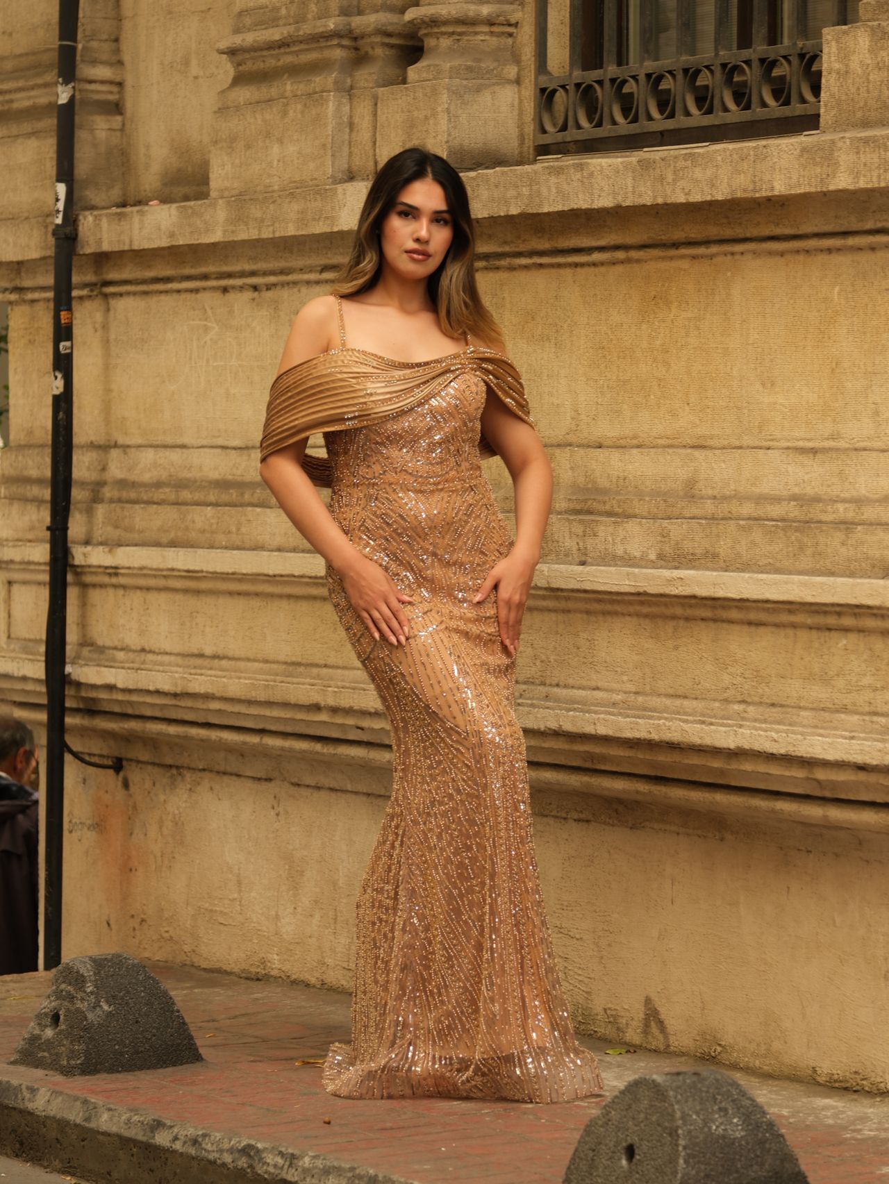
A gold sequin off-shoulder gown with a draped neckline, worn outdoors — Photo via Pexels
Metallic gowns follow the same undertone rule as every other color, only more strictly, because metal reflects light directly onto your face. Gold suits warm skin best, silver suits cool skin best, and rose gold suits neutral skin well. The gold sequin gown in the photo shows gold at full strength: it glows in daylight, it pairs naturally with warm skin, and it needs almost no jewelry, since the sequins already shine. If you have cool skin and love gold, try a paler, champagne gold rather than a deep yellow gold, and test it in daylight, since warm shop lights flatter gold on everyone and can mislead you.
Metallic fabric also hides and reveals fit problems at the same time. Sequin and metallic fabrics are usually stiff, so they hold a shape well, but they also show every pull and wrinkle, and they cannot be altered as easily as plain fabric. Before you buy, sit in the gown for ten minutes, since sequins can scratch at the waist and under the arms, and check the lining, since a fully lined metallic gown is far more comfortable than a half-lined one. For evening events, a metallic gown is a safe show-stopper in the right metal for your skin, and our winter wedding guest outfit ideas show how sequin dresses work for formal nights. Pick the metal that matches your undertone, and the gown will do the rest.
9. Prints and Patterns in Vintage Gowns
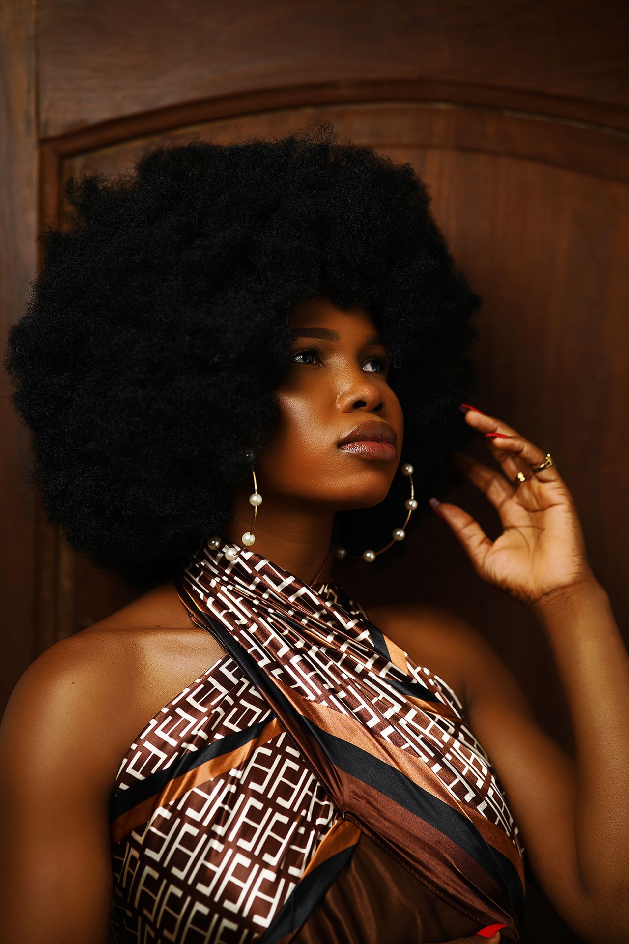
A brown and cream geometric satin dress with a wrapped neckline and large pearl hoop earrings — Photo via Pexels
Prints change the color question, because a printed gown does not have one color, it has a family of colors, and your skin only needs to suit the colors near your face. The geometric satin dress in the photo mixes brown, cream, and black, so the colors near the neckline matter most, while the colors lower down matter less. As a rule, match your shoes and bag to one color already in the print, rather than introducing a new color, and keep jewelry simple so nothing snags or competes with the pattern. A medium-scale print, like this one, suits most frames, while a very large print can overwhelm a petite frame and a very small print can disappear in photos.
Vintage prints also carry a dating clue that helps you judge the dress honestly. A print that looks faded, uneven, or worn thin in one area has likely seen a lot of sun or washing, and that wear will only get worse. Check the print inside the folds and under the arms, where fading shows first, and compare the color there with the color on the outside. If the print is even, the colors suit your undertone, and the scale suits your frame, a printed vintage gown can be more forgiving than a solid one, because the pattern gives the eye somewhere to go besides your skin. For help choosing the shape to go with your print, see our guide to different types of dresses, which explains A-line, fit-and-flare, and other silhouettes in plain words.
10. When a Rare Piece Should Not Override Fit and Color
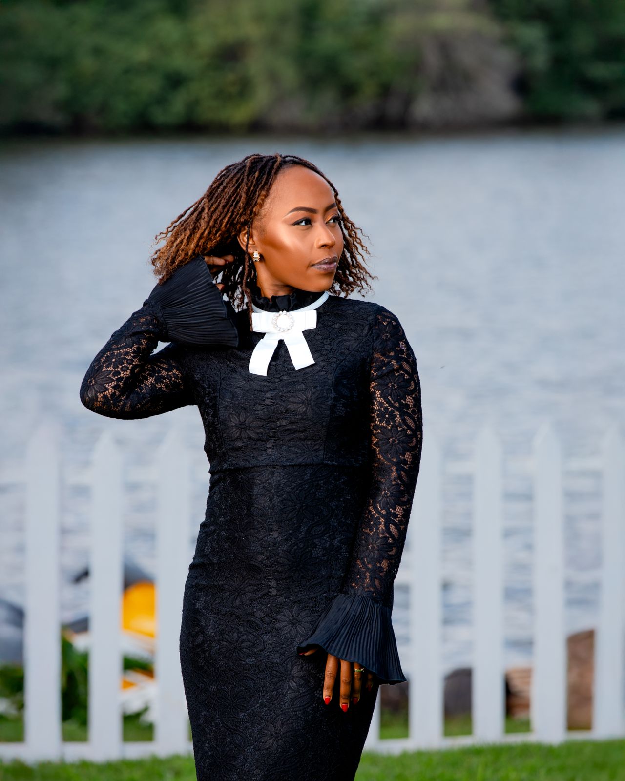
A black lace dress with a white bow collar and flared cuffs, by a lakeside fence — Photo via Pexels
Every vintage shopper meets the same temptation: a dress described as rare, archival, or one of a kind, in a color that does not quite flatter them, at a price that feels like a once-only chance. The black lace dress in the photo is a good test case for clear thinking. Black suits almost everyone, and the white bow collar gives the face a bright frame, so this dress works on color. But if the same dress had been pale, faded, or in a shade that washed you out, its rarity would not fix that. A rare dress you never wear because it makes you look tired is not a bargain, no matter how special its story is. Fit comes second to color in this guide, but it comes before rarity every time.
Before you pay a premium for a rare piece, run three checks. First, does the color flatter your face in daylight, not just under shop lights? Second, can you sit, walk, and raise your arms in it comfortably, since vintage sizes run small and old zippers and seams do not stretch? Third, can you afford the care it needs, since fragile silks and old beading often need a specialist cleaner? If any answer is no, walk away, even if the seller says another buyer is waiting. That pressure is part of vintage selling, and a better dress in a color that truly flatters you will come along. The best vintage gown is not the rarest one in the shop. It is the one you feel beautiful wearing, in a color that lifts your face, in a shape you can move in, at a price you can enjoy rather than regret.
Frequently Asked Questions
How do I know if a gown color washes me out?
Hold the dress to your face in daylight and look at your eyes, not the dress. If your eyes look brighter and your skin looks even, the color works. If your face looks flat, gray, or tired, the shade is too close to your skin tone or fights your undertone, and you should try a deeper or warmer version.
Can I wear a vintage gown if the color is not perfect for my skin?
Sometimes, yes. Add contrast near your face with earrings, a darker lip color, or a wrap in a deeper tone, and the gown can work. But if the dress still makes you look tired after those fixes, it is better to choose a different shade than to fight the dress all evening.
Should silhouette come before color when I shop vintage?
No, color should come first, because a perfect shape in the wrong color still washes you out. Once you have a short list of shades that flatter you, then choose the silhouette that fits your body best. Our halter neck formal dresses guide is a good place to compare shapes once your color list is set.
How do I test a vintage gown color in a shop with bad lighting?
Step near a window or door for daylight, and take a phone photo in that light, since cameras show washout clearly. Also check the fabric inside the folds, where the original color is best preserved, and compare it with the outside, which may have faded.
Is it worth buying a rare vintage gown in a color I am unsure about?
Only if the color flatters you in daylight and the fit is comfortable. Rarity does not fix a washout shade, a tight fit, or fragile fabric you cannot care for. A less rare gown in a color that lifts your face is always the better buy.
Final Thoughts
Choosing a vintage gown gets much easier once you stop asking which dress is the most special and start asking which shade makes your face look its best. Find your undertone, try your color family first, test every candidate in daylight, and let silhouette come second. Pale shades, bright shades, and metallics all follow the same rule: the right shade makes your eyes brighter and your skin more even, while the wrong shade makes you look at the dress instead of the person wearing it.
And when a rare piece tempts you in a color that does not flatter you, remember that the story of a dress is not worth an evening of feeling washed out. Walk away, keep your short list, and wait for the gown that gets both things right: a color that lifts you, and a shape you can move in. That is the vintage gown you will actually wear, photograph well in, and reach for again, and it is worth more than any rare label on a dress that never leaves the closet.
Sources
- How to Style Vintage Prints to Suit Your Skin Undertone
- Ivory vs White Wedding Dress Guide
- How to Choose a Champagne Color Dress for Your Skin Tone
- How to Choose the Best Grey Vintage Dress: A Complete Buying Guide
Gallery

A white satin dress with a bold floral skirt in golden sunlight — Photo via Pexels
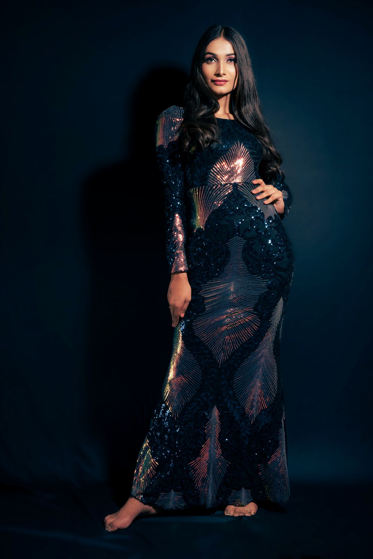
A dark sequin long gown with iridescent panels, in a studio portrait — Photo via Pexels

A red, green, and blue plaid 1950s shirtwaist dress with a white collar and red buttons — Photo via Wikimedia Commons

No comments:
Post a Comment