Neutral rooms look effortless, which is exactly why they are hard to get right. The difference between a calm, expensive-looking living room and a flat beige box comes down to one thing: neutrals are a system, not a paint color. Undertones, texture, and light do all the work. Get those three right and white, beige, and gray become the most flexible palette you will ever decorate with — timeless, forgiving, and easy to refresh without repainting a single wall.
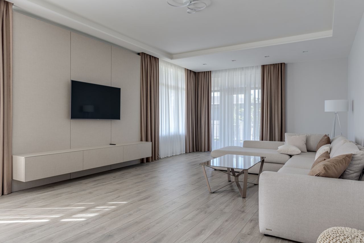
A neutral living room done well — warm tones, layered texture, soft light — photo via Pexels (free license).
1. Start with Warm Beige Walls
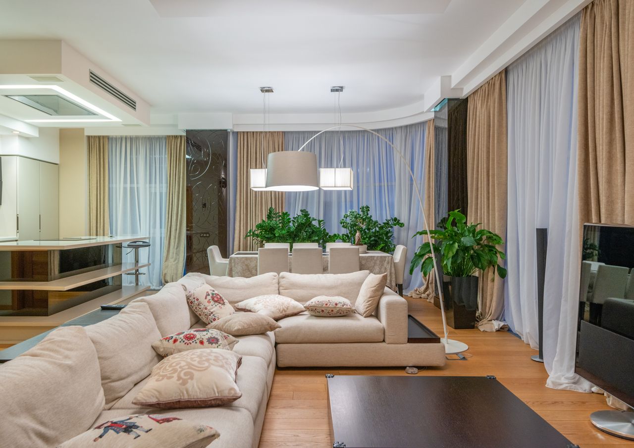
Warm beige walls glow in daylight and flatter both light and dark furniture — photo via Pexels (free license).
Beige is the workhorse of neutral design — warm enough to feel welcoming, quiet enough to disappear behind your furniture. The key is undertone: pink-beige feels rosy at sunset, yellow-beige reads creamy, gray-beige (greige) stays modern. Test a large swatch and look at it morning, noon, and night before committing. One warm beige on every wall gives small rooms a seamless, larger feel.
Tip: if your room faces north and gets cool light, go one shade warmer than you think you need.
2. Layer Whites Instead of Using One
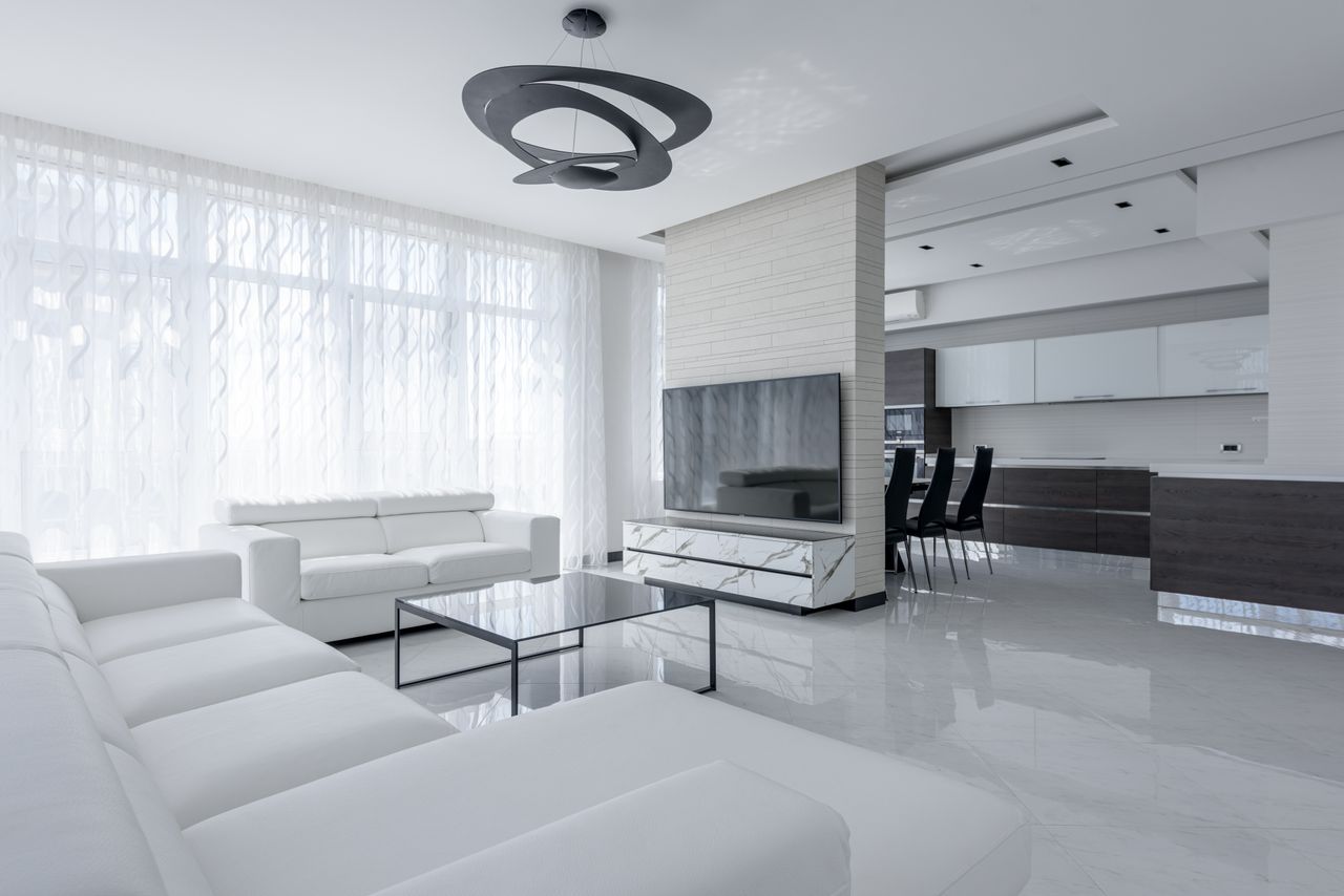
Ivory, cream, and soft white together create depth a single white cannot — photo via Pexels (free license).
A single white can look sterile; five whites look designed. Mix ivory, cream, chalk, and soft white across sofa, cushions, rug, and curtains, and the subtle shifts create depth without any real contrast. This is also the highest-light palette you can build — it bounces daylight into corners and makes small rooms feel twice their size. Keep all the whites on the same warm-or-cool side or they will fight.
Tip: hold fabric swatches together in daylight. If one looks dingy next to the others, its undertone is off.
3. Choose Fewer, Better Furniture Pieces
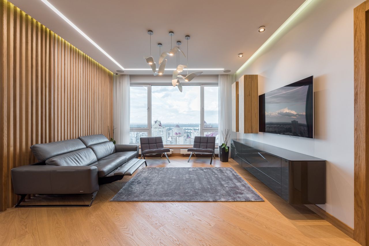
Fewer pieces with clean lines let a neutral palette breathe — photo via Pexels (free license).
Minimalist furniture is not about owning nothing — it is about giving each piece room to be seen. Simple silhouettes with straight lines in gray, beige, or white keep the eye moving calmly around the room. Fewer pieces also means less visual noise competing with your palette, easier cleaning, and a room that stays calm even on messy days. Buy the best-made simple piece you can afford rather than three fussy ones.
Tip: leave at least a meter of clear floor around your main seating. Space is part of the design.
4. Let Texture Be Your Color
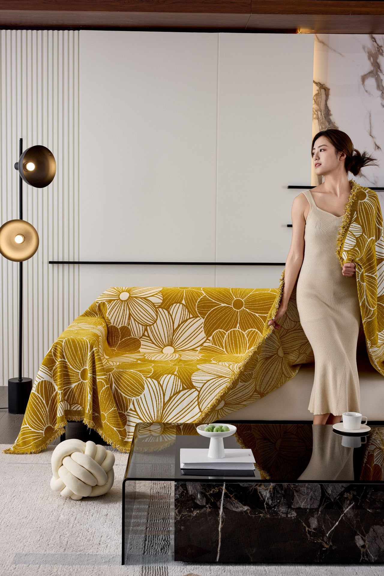
When color steps back, texture steps forward — wool, linen, and jute do the talking — photo via Pexels (free license).
Here is the real secret of interesting neutrals: texture replaces color. A nubby wool rug, a linen throw, a jute basket, a bouclé cushion — each catches light differently, so a beige room reads as rich instead of flat. Mix at least three textures in every seating area. Natural materials (wool, cotton, linen, jute) age gracefully; synthetics tend to look tired fast.
Tip: squint at the room. If it all blurs into one flat tone, you need more texture, not more color.
5. Anchor with a Neutral Sofa, Play with Cushions

The sofa stays neutral forever; the cushions do the seasonal talking — photo via Pexels (free license).
A neutral sofa is the smartest big purchase in this palette — it will outlive every trend. Then let cushions do the styling: three to five in mixed textures, all within your neutral family, maybe one soft pattern. Because cushions are cheap to swap, your whole room can shift with the seasons for almost nothing. Keep the sofa's fabric performance-grade if you have kids or pets; beige shows less than white.
Tip: odd numbers of cushions look styled; even numbers look staged. Go with three or five.
6. Warm It Up with Light Wood
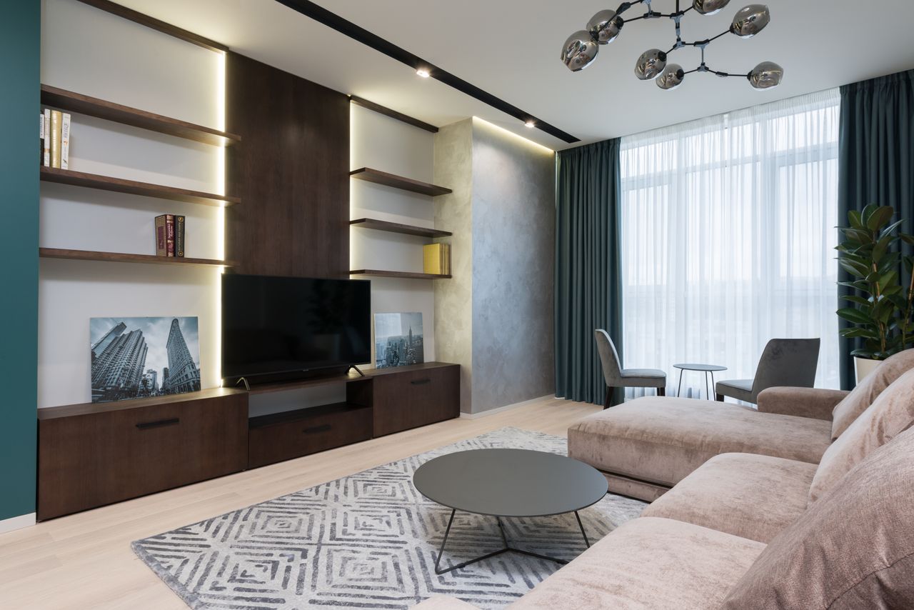
Light oak and pine add organic warmth without darkening the palette — photo via Pexels (free license).
Wood is what keeps a neutral room from feeling cold. Light oak, pine, and ash add organic warmth while keeping everything bright — a coffee table, open shelving, or even just picture ledges. The grain gives the eye somewhere to rest, which matters in a low-contrast room. Keep finishes consistent: mixing pale oak with dark walnut in one small room usually looks accidental.
Tip: repeat the wood tone at least three times (table, shelf, frame) so it reads as a choice.
7. Light in Layers, Not from the Ceiling
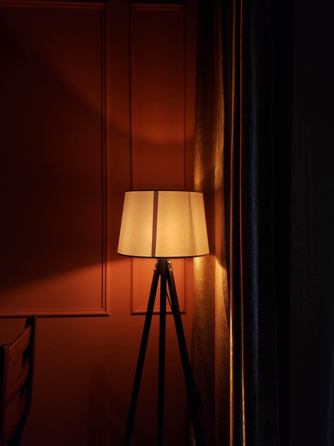
Floor and table lamps at different heights create the cozy evening glow neutrals need — photo via Pexels (free license).
Neutral palettes live or die by lighting. One ceiling light flattens everything; three warm sources at different heights — floor lamp in the corner, table lamp by the sofa, a small glow on the shelf — give the room depth after dark. Stick to warm bulbs (2700K) so whites read creamy instead of clinical. Put the main lamps on dimmers and the room will feel expensive every evening.
Tip: every seat should be within arm's reach of a light source. That is the whole rule.
8. Hang Quiet, Confident Wall Art
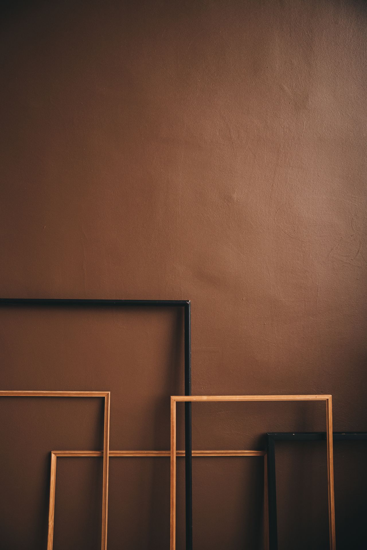
Abstract and nature prints in matching frames keep walls calm and intentional — photo via Pexels (free license).
Bare neutral walls can feel unfinished rather than minimal — art fixes that. Stay in the palette: abstract washes, line drawings, nature prints in black, white, beige, and soft gray. Frames matter as much as the art; keep them consistent (all thin black, all light wood) for a calm grid, or go gallery-style for more personality. One large piece usually calms a room more than six small ones.
Tip: hang art so its center is at eye level — about 145cm from the floor. Most people hang too high.
9. Add One Strong Green Note
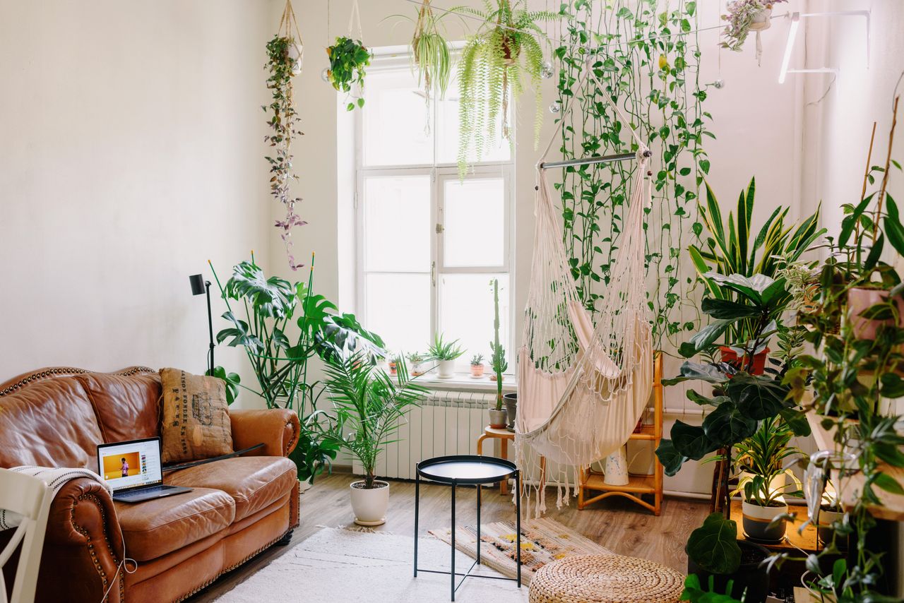
A single green plant is the one color a neutral room never regrets — photo via Pexels (free license).
Green is the one color that never breaks a neutral scheme — it reads as nature, not decoration. A single sculptural plant (fiddle-leaf fig, olive tree, tall snake plant) gives the eye a focal point and makes every beige around it look richer. Place it where it catches daylight, near a window or in a bright corner. If you kill plants, one good faux olive tree in a real-looking pot is a forgivable secret.
Tip: one large plant beats five small ones. Scale is what makes it look designed.
10. Keep the Layout Open and Breathing
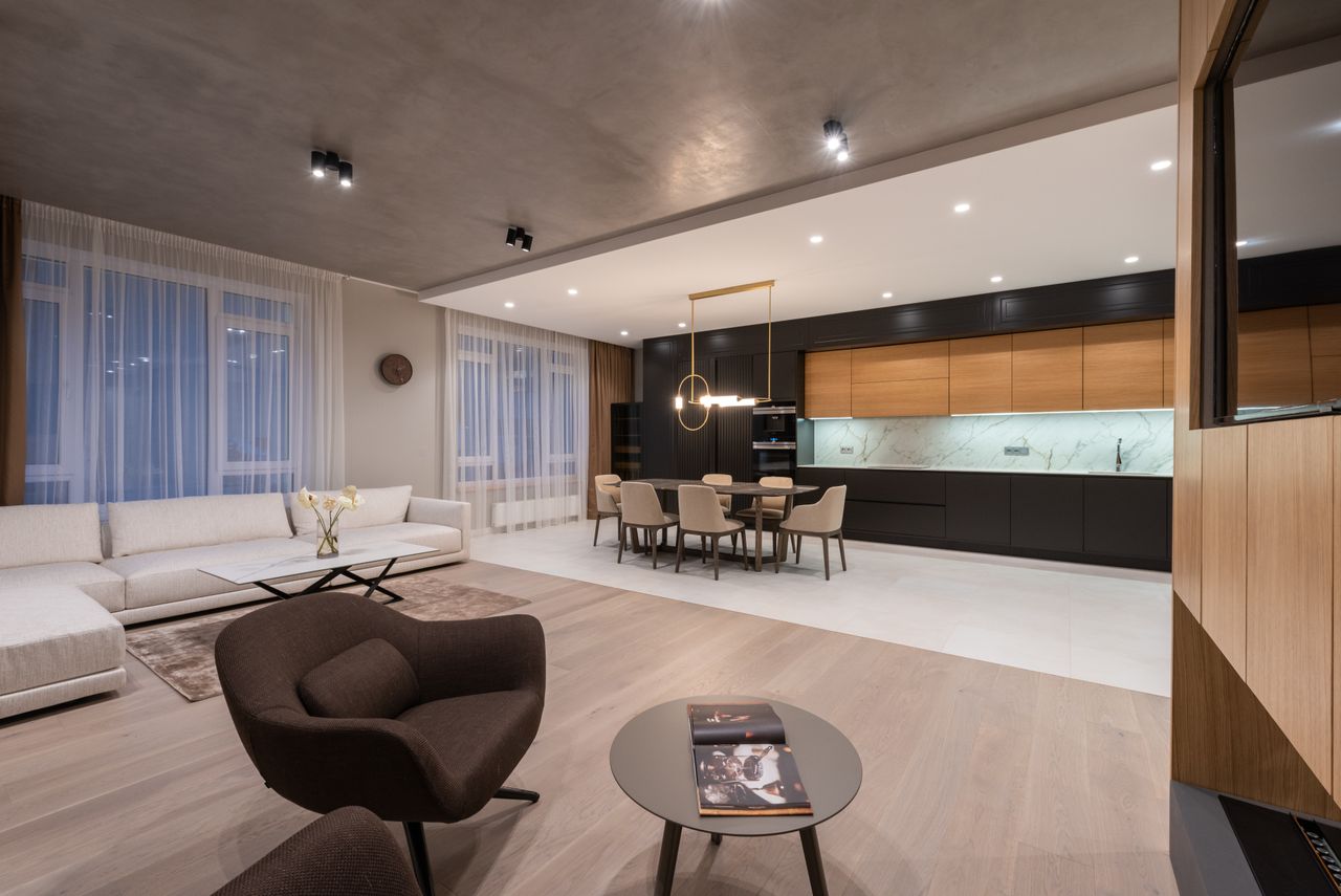
Clear pathways and spaced-out furniture let neutral tones do their spacious work — photo via Pexels (free license).
Neutrals and open layouts amplify each other: pale tones erase visual boundaries, and clear space lets light travel. Float furniture off the walls, keep pathways genuinely walkable, and resist filling every corner. In open-plan spaces, use one rug per zone to define areas without walls — the rug, not the paint, draws the room's lines.
Tip: if you cannot walk a clear path between sofa and window, something needs to leave the room.
11. Mix Modern Lines with One Rustic Soul
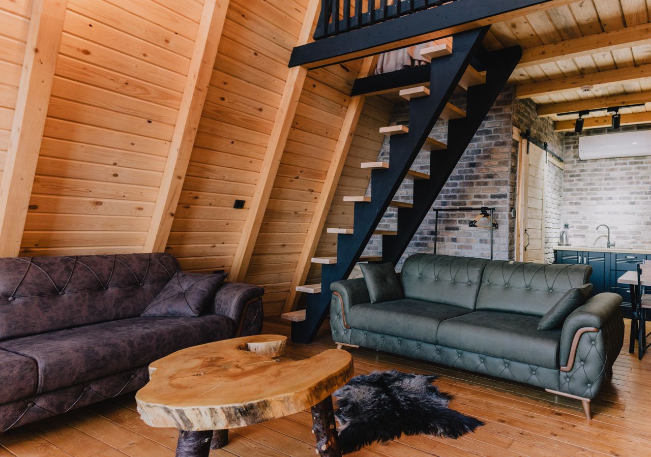
A sleek sofa plus one weathered wood piece — contrast keeps neutrals from feeling flat — photo via Pexels (free license).
All-modern can feel like a showroom; all-rustic can feel like a cabin. The sweet spot is modern bones with one or two rustic souls — a sleek sofa beside a weathered wood coffee table, clean shelving holding handmade ceramics. The neutral palette is what lets the two styles share a room without arguing: when everything is beige and oak, contrast comes from texture and age, not color. Explore more decor ideas if you want to see this balance in smaller spaces, and our bedroom ideas carry the same calm palette upstairs.
Tip: limit the rustic pieces to two or three. One is an accent; five is a theme.
12. Finish with Sheer, Light Curtains
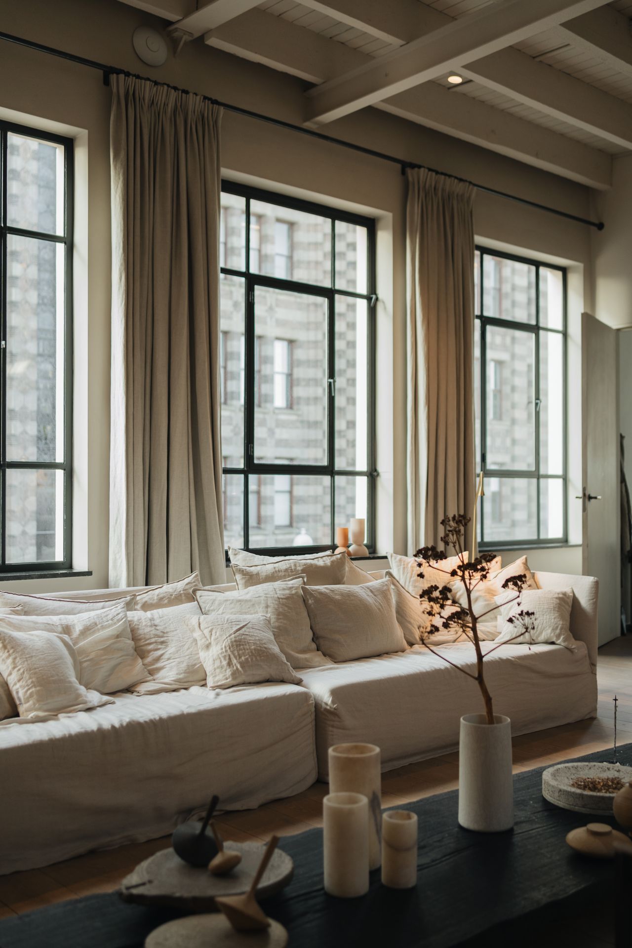
Sheer linen filters daylight into the soft glow neutral rooms are made for — photo via Pexels (free license).
Curtains are the soft frame around your room's best asset — daylight. Sheer or light linen in white or ivory filters sun into a glow instead of blocking it, and fabric softens all the hard lines of furniture. Hang the rod high and wide, and let the panels kiss the floor; short curtains visually shrink windows. In a neutral room, curtains should be felt more than noticed.
Tip: buy curtains one size longer than you think. Fabric pooling slightly on the floor always looks more expensive.
Conclusion
A calm, modern neutral living room is not about owning beige things — it is about the system: warm undertones that agree with each other, texture doing the work of color, light in layers, and space to breathe. Build it in that order and the room practically styles itself. For more ways to keep the palette soft and cozy through the seasons, that guide pairs perfectly with everything above.
Neutral Living Room Inspiration Gallery
More calm rooms to borrow ideas from — notice how texture does the talking in every one.
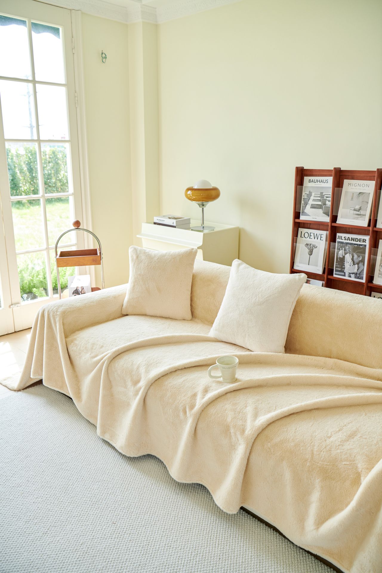
A cream sofa styled with layered cushions and a soft throw — photo via Pexels (free license).
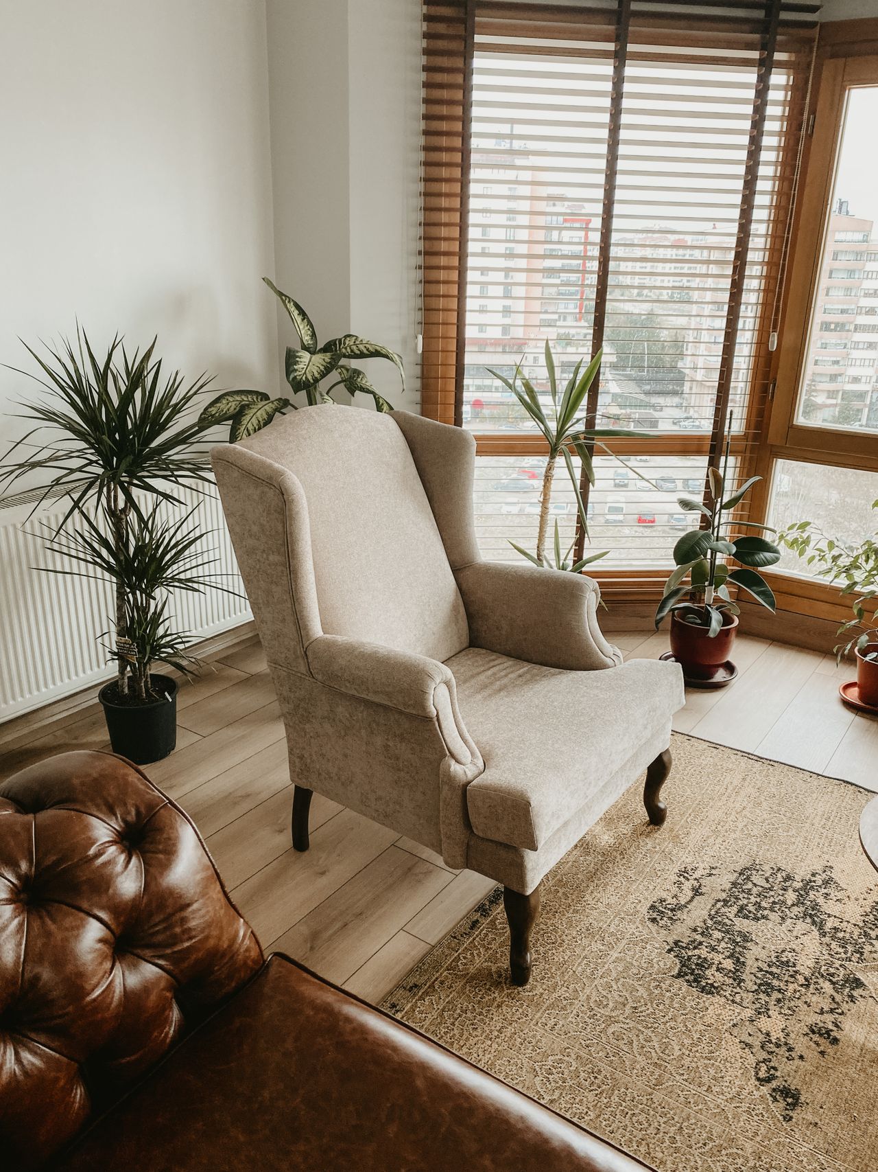
One good armchair in warm beige anchors a quiet corner — photo via Pexels (free license).
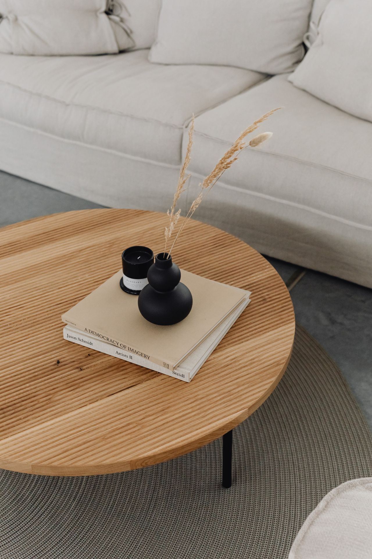
Coffee table styling in natural materials keeps the palette grounded — photo via Pexels (free license).
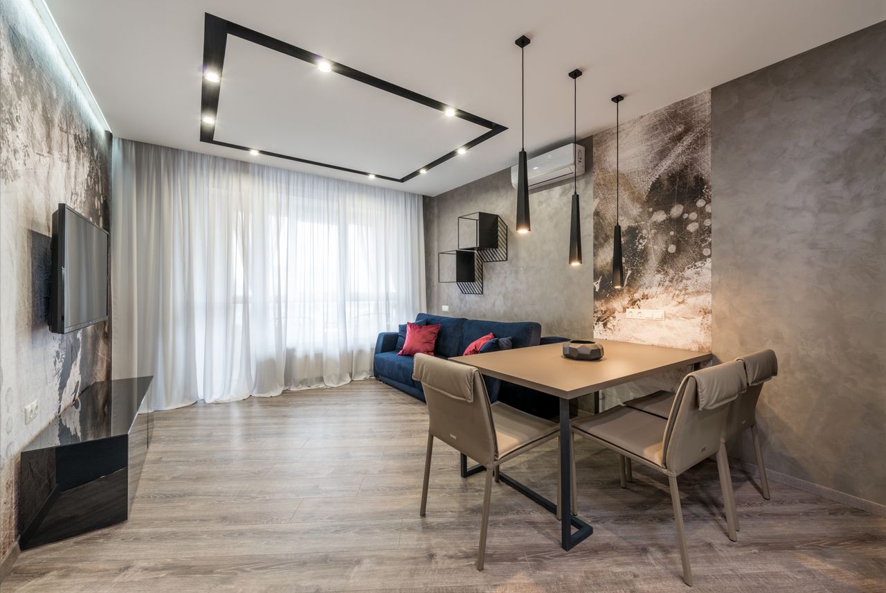
A sculptural pendant adds the evening layer of warm light — photo via Pexels (free license).
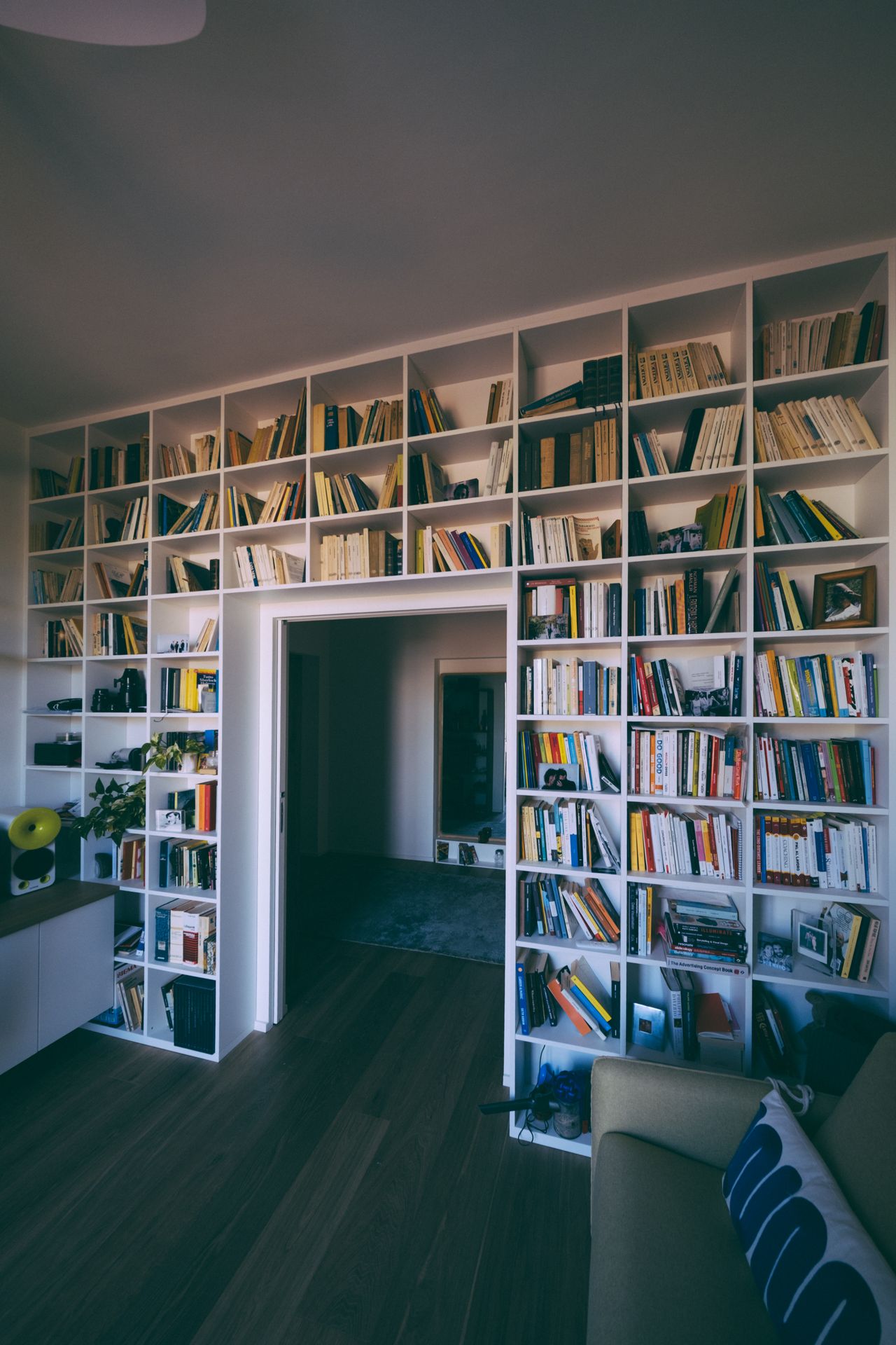
Open shelving in light wood keeps storage part of the decor — photo via Pexels (free license).
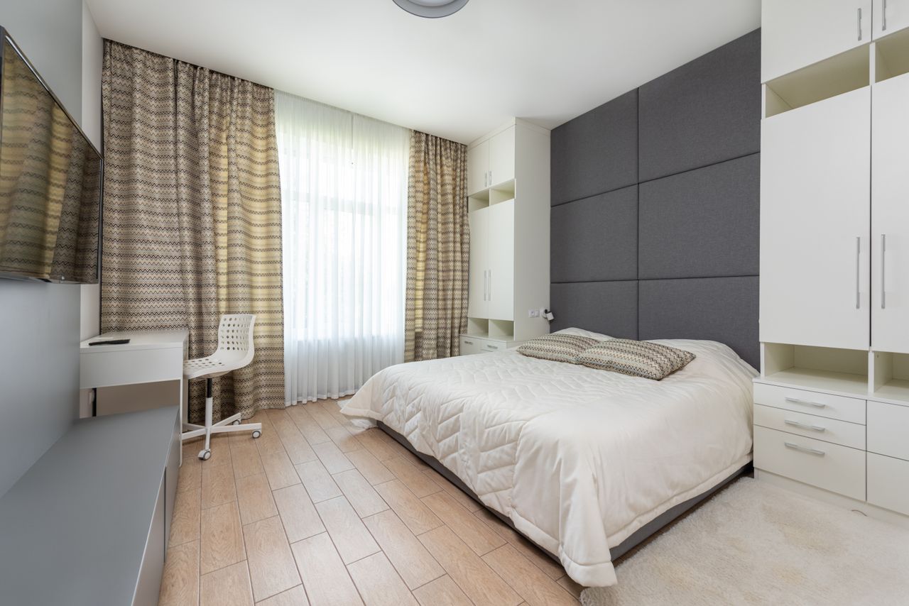
The finished effect: calm, light, and quietly layered — photo via Pexels (free license).
FAQs
1. What colors are considered neutral for living rooms?
Neutral colors include white, beige, gray, cream, and soft brown tones.
2. Are neutral living rooms boring?
No, adding textures and layers makes them stylish and interesting.
3. How can I make a neutral room cozy?
Use soft lighting, rugs, and warm materials like wood.
4. Can I add color to a neutral living room?
Yes, use cushions or plants for small pops of color.
5. Is neutral decor expensive?
No, you can create it on any budget with simple items.
6. Do neutral styles work in small spaces?
Yes, they make small rooms look bigger and brighter.

No comments:
Post a Comment